Formal linear floristry is a strategic act of spatial engineering, transforming flowers from simple decoration into architectural assets that define a brand’s luxury identity.
- Success lies not in the quantity of blooms, but in the deliberate use of line, negative space, and form to command attention and sculpt a room’s atmosphere.
- This approach justifies a premium investment by creating a memorable visual statement that is more powerful and sophisticated than a conventional mass of flowers.
Recommendation: Shift your perspective from filling a vase to curating a visual grammar; treat each stem as a line in an architectural drawing and every empty space as an intentional design element.
In the world of corporate and hotel decor, floral arrangements are often seen as a finishing touch—a pleasant but ultimately interchangeable element. The conventional approach defaults to mass and volume: large, lush bouquets designed to fill a space with colour and fragrance. While charming, this method treats flowers as mere decoration, a background element that is easily overlooked. It’s a missed opportunity to make a powerful, sophisticated statement about the brand and the environment it cultivates.
What if the true measure of impact was not abundance, but precision? What if a single, perfectly placed branch could command more attention than a hundred roses? This is the core philosophy of formal linear architecture in floristry. It is a disciplined approach that moves beyond simple decoration and into the realm of spatial engineering. This is not about minimalism for its own sake; it is about using the fundamental principles of design—line, form, and space—to create unforgettable visual experiences. By treating flowers as architectural assets, we can sculpt a room’s atmosphere and communicate a message of quiet confidence and refined luxury.
This guide will deconstruct the core tenets of formal linear design. We will explore how vertical lines manipulate perception, why empty space is a powerful tool, and how the strategic grouping of materials creates structural integrity. By understanding these principles, you can elevate floral design from a simple expense to a strategic investment in brand identity.
This article provides a comprehensive framework for mastering the art of formal linear design. Explore the sections below to understand the specific techniques that transform minimal stems into maximum impact.
Summary: Mastering the Art of Formal Linear Floristry
- The Vertical Line: How to Make a Room Feel Taller with Gladioli?
- Negative Space in Linear Design: Why the Void Is as Important as the Flower?
- Zoning: Why Grouping Flowers by Type Creates Architectural Strength?
- The Right Vase: Why a Tall Cylinder Suits Linear Stems Best?
- Premium Stems: Why Less Flowers Can Cost More in Linear Design?
- Line over Mass: Why One Branch Can Be More Powerful Than 50 Roses?
- The Star Performer: How Space Makes a Premium Flower Shine?
- How to Apply Asian Design Principles to Contemporary Western Floristry?
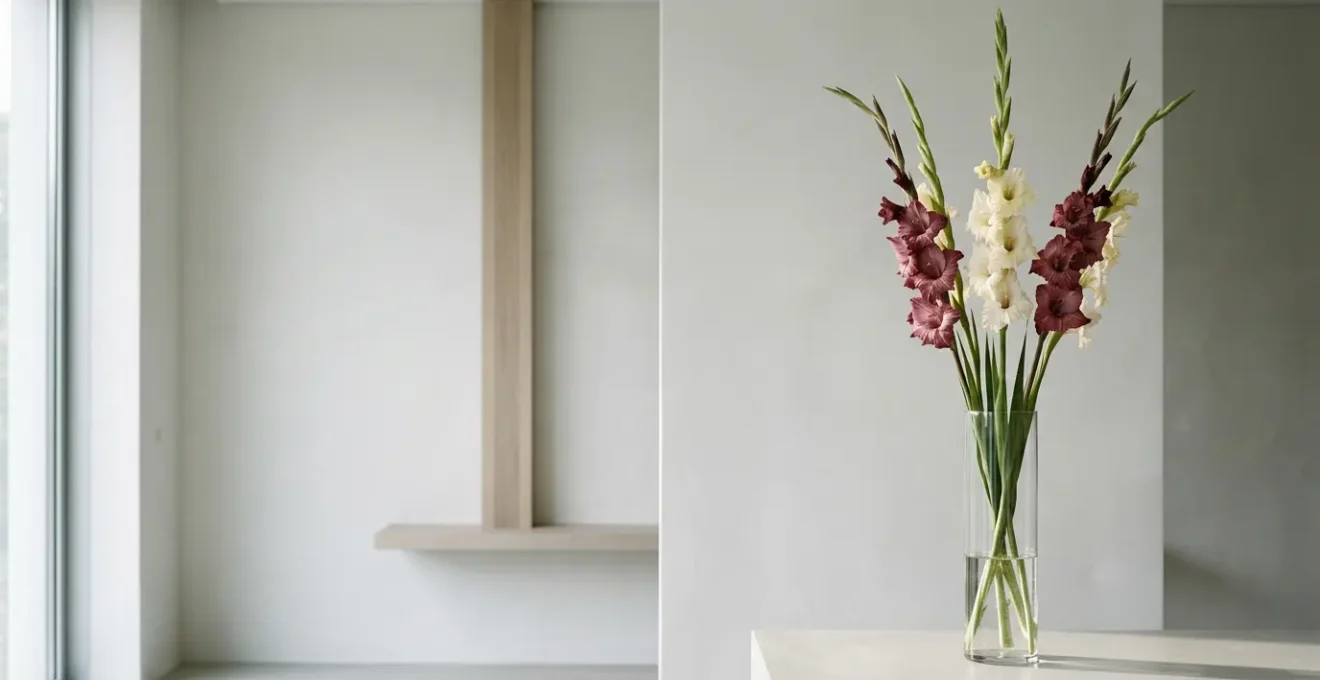
The Vertical Line: How to Make a Room Feel Taller with Gladioli?
The human eye is instinctively drawn to lines, and vertical lines have a unique and powerful psychological effect. They guide our gaze upward, creating an illusion of height, space, and aspiration. This is a fundamental principle of architecture used for centuries to inspire awe and convey importance. As noted in a recent publication on architectural psychology, the effect is deeply ingrained in our perception. In an analysis of architectural forms, it was observed:
Vertical lines draw the eye upward, creating a sense of height and grandeur. This is why many monumental buildings, such as cathedrals and skyscrapers, feature strong vertical lines—they convey a sense of importance and dominance.
– Architecture & Design Analysis, Emotional Design: The Impact of Curves and Lines on Human Experience in Architecture
In floral design, we harness this same principle. A tall stem like a Gladiolus, Delphinium, or Eremurus is not just a flower; it is an architectural element. Placed in a lobby or conference room, its strong verticality actively works to make the ceiling feel higher and the space more expansive and elegant. This isn’t just decoration; it’s a subtle but effective act of spatial engineering.
As the image demonstrates, the arrangement doesn’t just occupy space; it actively directs the viewer’s experience of that space. The upward thrust of the stems creates a dynamic energy, transforming a static corner into a point of interest that elevates the entire room’s perceived dimensions. This is the power of a single, well-chosen line.
Ultimately, employing strong vertical elements is the first step in using floral design as a tool to consciously shape and enhance an architectural environment, making the space itself feel more luxurious and considered.
Negative Space in Linear Design: Why the Void Is as Important as the Flower?
In conventional Western floristry, the focus is on the “positive space”—the flowers, the foliage, the tangible elements. The goal is often to fill the canvas. Formal linear design, however, inverts this priority, teaching us that the empty space—the “negative space”—is an active and essential component of the composition. It is the silence between musical notes that creates rhythm and the pause in a speech that adds emphasis. The void is not an absence; it is a presence.
This concept is eloquently captured by design experts, who state that negative space acts as a frame, providing visual breathing room and directing focus. As Mads Soegaard of the Interaction Design Foundation explains, “Negative space is like a canvas: it’s the background that holds the elements together in a design, enabling them to stand out.” Without sufficient negative space, even the most beautiful flower is lost in the visual noise. By intentionally creating voids, we give the eye a place to rest, which in turn magnifies the importance and sculptural beauty of the forms that are present.
This philosophy has deep roots, drawing from traditional Japanese aesthetics, where the concept is known as ‘Ma’. ‘Ma’ does not refer to an empty void but to the energetic interval or pause between objects. It is the space that holds potential and creates tension, making the entire composition feel alive and balanced. In a linear arrangement, the space between two branches or the void above a single bloom is charged with this energy, becoming as integral to the design as the physical stems themselves.
By embracing negative space, a designer dictates what the viewer sees and, more importantly, how they see it. It is the ultimate tool of curation, allowing a single, perfect lily to have more impact than a dense bouquet of dozens.
Zoning: Why Grouping Flowers by Type Creates Architectural Strength?
Zoning, or “blocking,” is a technique where flowers and foliage are grouped together by type, colour, or texture to form distinct visual masses within an arrangement. This method is borrowed directly from architecture and landscape design, where materials like concrete, glass, and wood are used in blocks to create structure, rhythm, and clarity. Instead of a random intermingling of different elements, zoning creates a bold and intentional visual grammar that the eye can easily read and appreciate.
When flowers are mixed in a diffuse, “garden-style” way, individual forms can get lost. The eye sees a pleasant texture but no clear structure. By grouping all the ranunculus in one zone, all the eucalyptus in another, and all the calla lilies in a third, each material’s unique character is amplified. The velvety density of the ranunculus creates a solid block of colour, while the sleek lines of the calla lilies become a powerful vertical statement. This technique transforms flowers from individual specimens into cohesive, architectural building blocks.
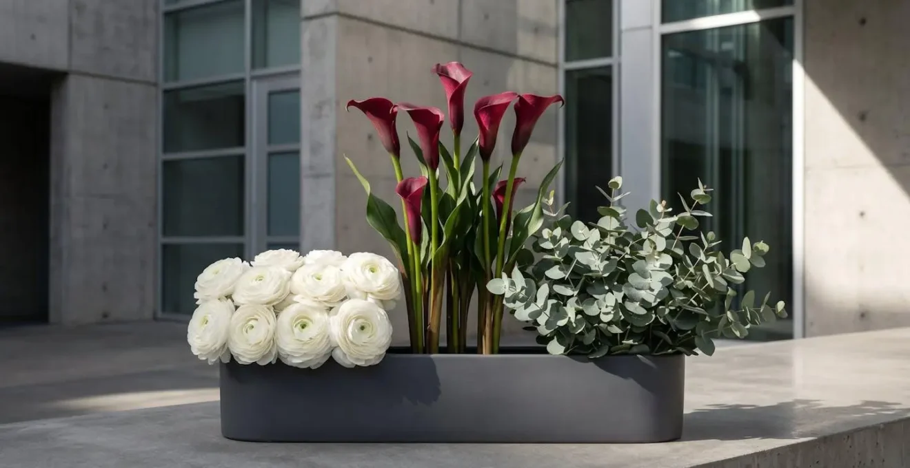
This purposeful grouping adds a sense of order and sophisticated intent. It demonstrates a high level of design thinking, showing that every element has been placed with purpose to contribute to a larger, unified whole. The result is an arrangement that feels structurally sound and visually powerful, holding its own as a sculptural object within a room rather than receding into the background. It is a mature design choice that communicates confidence and clarity.
Zoning allows the floral architect to control the visual weight and flow of the composition, guiding the viewer’s eye through a deliberate sequence of colour and texture, much like a painter leads the eye across a canvas.
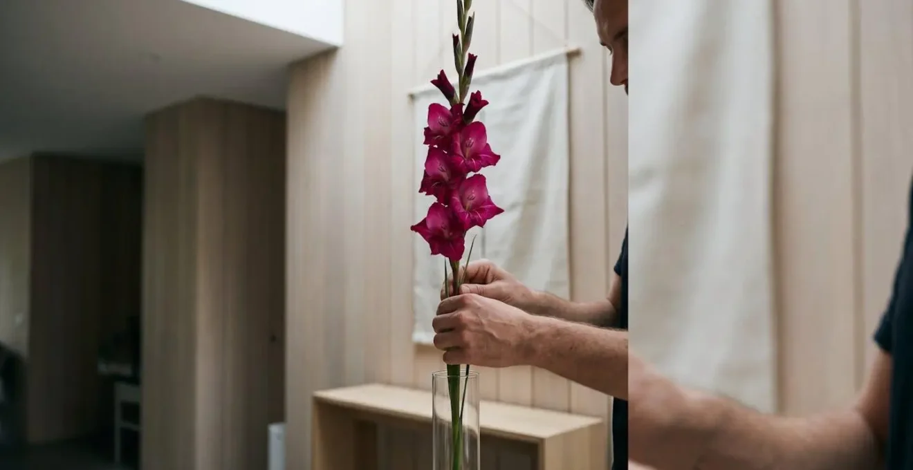
The Right Vase: Why a Tall Cylinder Suits Linear Stems Best?
In linear design, the vase is never an afterthought; it is the foundation, the pedestal that either enhances or undermines the entire architectural statement. While an ornate vase can be a work of art in itself, for formal linear compositions, its role is to support and clarify the lines of the arrangement, not compete with them. This is why a simple, tall, cylindrical glass vase is often the most sophisticated choice. Its form is one of pure, unadorned geometry.
A tall cylinder does three things perfectly. First, its height provides the necessary physical support for long stems, ensuring they remain upright and stable. Second, its clean, vertical lines directly mirror and reinforce the upward thrust of the floral elements, creating a harmonious and unified silhouette. Third, if the glass is clear, it makes the stems themselves a visible part of the design, celebrating the “architecture” from base to tip and revealing the clean water, a key principle in many design philosophies. The goal is to create a seamless extension of the stems, not a decorative interruption.
This focus on balance and proportion is a core tenet of classical design. For example, according to classical Ikebana principles, the ideal height of the tallest floral element is often around 1.5 times the height of the vase. A tall cylinder provides the visual weight and scale necessary to anchor such a composition, preventing it from looking top-heavy or unstable. As The Floral Society notes regarding the philosophy, “Ikebana floral vases should be aesthetically pleasing, balanced within the design and should leave the surface of the water visible.” This visibility connects the design to its natural, living source.
Ultimately, the perfect vase in linear design is one that disappears, allowing the sculptural beauty of the lines to take centre stage. Its simplicity is its strength, providing a quiet, confident foundation for the entire piece.
Premium Stems: Why Less Flowers Can Cost More in Linear Design?
It is a common paradox that a client may face: an arrangement with five perfect stems can command a higher price than a dense bouquet of fifty. This is where the floral architect must educate the client on the concept of value. In formal linear design, we are not selling quantity; we are providing curated scarcity and artistic impact. The cost is not in the volume of material, but in the perfection of each element and the skill required to place it.
A premium stem—a Phalaenopsis orchid with a flawless arch, a gladiolus with perfectly spaced blooms, or a branch with a uniquely compelling gesture—is a product of significant investment. It requires expert cultivation, meticulous post-harvest care, and careful transportation to arrive in pristine condition. Each stem in a linear design is a “star performer” and must be flawless because it is completely exposed to scrutiny. There are no lesser “filler” flowers to hide imperfections. The price reflects this uncompromising standard of quality. As sustainability expert Debra Prinzing notes, discerning clients are increasingly aware of this value chain, wanting to know their purchase supports quality and provenance.
Furthermore, the market itself is shifting. Overall consumer spending is moving towards higher-value products, not just in floristry but across luxury goods. A recent industry report highlights this trend, noting that the market shows a significant upward trajectory, reflecting a shift in consumer investment in premium floral products. This demonstrates a growing appreciation for quality over quantity. An investment in a linear arrangement is an investment in a piece of living sculpture, a statement of taste and discernment that a generic bouquet simply cannot match.
The cost, therefore, covers not just the flower itself, but the expertise to select it, the confidence to give it space, and the vision to transform it into an architectural asset that provides a significant return in aesthetic impact and brand perception.
Line over Mass: Why One Branch Can Be More Powerful Than 50 Roses?
The power of a single line versus a mass of colour is the difference between a whisper and a shout. A dense bouquet of 50 roses shouts “celebration” or “romance” in a generalized, easily understood language. It is beautiful but often predictable. A single, gnarled branch of contorted hazel, placed with intention in a simple vase, whispers a far more complex and intriguing story. It speaks of time, resilience, and the beauty of imperfection. Its power lies not in its lushness, but in its narrative character.
Every twist and turn of the branch is a line that guides the eye on a journey. Its stark silhouette against a clean wall carves out the negative space around it, forcing the viewer to slow down and contemplate its form. Unlike the uniform perfection of 50 cultivated roses, the branch is a unique individual. It has a history written in its bark. This singular focus creates a point of meditation in a room, a quiet moment of visual and intellectual engagement that a busy mass of petals cannot provide.

This approach demands confidence from both the designer and the client. It is a declaration that the brand’s identity is strong enough not to need to shout. It signifies an appreciation for subtlety, form, and the profound impact of a well-told story. In a corporate environment, this single branch can communicate more about the company’s values—of strength, uniqueness, and considered thought—than any generic display. It becomes a conversation piece, an object of art rather than a simple floral arrangement.
Choosing line over mass is choosing poetry over prose. While both have their place, the carefully chosen words of a poem often resonate longer and more deeply than a page of descriptive text. In floristry, that poetic line is often found in a single, powerful stem.
The Star Performer: How Space Makes a Premium Flower Shine?
Every high-end linear arrangement has a “star performer”—that one exquisite bloom or branch that serves as the focal point. However, its stardom is not solely due to its intrinsic beauty; it is conferred by the strategic use of space around it. As design theory from MasterClass explains, “The use of negative space can also help draw attention to the main focus of the work.” Space is the stage, and without a properly lit and uncluttered stage, even the most talented performer cannot truly shine.
Surrounding a premium flower with a dense crowd of other elements diminishes its impact. The eye becomes confused, unsure where to look, and the unique qualities of the star bloom are diluted. By isolating the star—giving it a generous berth of negative space—we create visual hierarchy. We are explicitly telling the viewer, “Look here. This is important.” This isolation allows every detail of the star performer to be appreciated: the delicate veining on an orchid petal, the complex geometry of a protea, or the graceful curve of a calla lily’s stem.
This principle is applied with nuance depending on the specific characteristics of the flower. The treatment of space is not one-size-fits-all, requiring an architect’s understanding of form and structure.
Case Study: Differentiated Spatial Treatment
A recent trend analysis from Homes & Gardens highlights how premium floral styling differentiates its spatial approach based on the flower’s structure. A structurally complex flower like a Phalaenopsis orchid, with its airy, cascading form, is given intricate, complementary negative space that allows the viewer to see *through* the design, appreciating its delicate architecture. In contrast, a dense, opulent bloom like a garden peony is given a simple, wide, uncluttered spatial berth. This allows its lush, heavy form to fully expand and dominate its territory without competition, showcasing its luxuriousness.
By mastering the art of creating space, the floral architect ensures that the investment in a premium stem pays the highest possible dividend in visual impact, transforming it from a beautiful flower into an unforgettable icon.
Key Takeaways
- Line Defines Space: Use strong vertical stems to create an illusion of height and grandeur, actively engineering the perception of a room.
- The Void is a Tool: Treat negative space as an active element that directs focus, adds drama, and amplifies the importance of each stem.
- Zoning Creates Strength: Group materials by type to build visual weight and architectural clarity, transforming flowers into powerful compositional blocks.
How to Apply Asian Design Principles to Contemporary Western Floristry?
The elegant minimalism and profound symbolism of Asian floral design, particularly Japanese Ikebana, offer a powerful antidote to the often-cluttered aesthetic of traditional Western arrangements. While Western floristry has historically prioritized mass, colour, and symmetry, Ikebana is founded on the principles of line, asymmetry, and the dynamic relationship between elements and the space they inhabit. As The Floral Society explains, “Minimalism is at the heart of ikebana setting it apart from fuller western style of arranging… your emotions guide your design, as opposed to logic.”
Applying these principles does not mean abandoning Western flowers or contexts; it means adopting a new mindset. It’s about shifting focus from “filling a vase” to “creating a living sculpture.” The core idea is to express nature in its ideal state, not just to display cut flowers. This involves appreciating the entire plant—stem, leaf, and flower—and understanding that each has a role. The asymmetrical structure, often based on a scalene triangle, creates a sense of movement and naturalism that is far more dynamic than a rigid, symmetrical dome.
For the Western floral architect, this translates into a practical framework for creating compositions that are both modern and deeply rooted in principle. The classic Ikebana structure of Shin, Soe, and Hikae provides a simple yet profound guide to achieving balance and harmony with minimal elements. It is a visual grammar that can be adapted using locally available, non-traditional stems to create something entirely new yet philosophically coherent.
Action Plan: The Shin-Soe-Hikae Framework for Western Stems
- Shin (Heaven): Select the tallest, most vertical element—the primary line that connects with the sky. For Western applications, use tall stems like delphinium, gladioli, or a single elegant branch to establish this dominant vertical.
- Soe (Man): Choose a secondary stem at approximately 2/3 the height of Shin, angled to create dynamic tension. Ranunculus, spray roses, or ornamental grasses work well to represent the human realm and create visual movement.
- Hikae (Earth): Place the lowest element at roughly 1/3 of Shin’s height, grounding the composition. Use fuller blooms like garden roses, peonies, or clustered eucalyptus to anchor the design and emphasize connection to earth.
- Asymmetrical Placement: Arrange all three elements in an asymmetrical triangular structure, ensuring they emanate from a single point to mimic natural growth patterns while maintaining visual balance.
By integrating these Asian design philosophies, a florist can elevate their work from mere decoration to a thoughtful art form, offering clients a level of sophistication and narrative depth that sets their brand apart as true floral architects.