In summary:
- Mastering ombré goes beyond lining up colors; it’s about understanding color theory to tell a visual story.
- Success lies in using “bridge” flowers with natural multi-tonal pigments to create seamless transitions.
- The placement of your darkest blooms dictates the arrangement’s focal point and emotional impact.
- Advanced techniques like custom dyeing and understanding undertones elevate a simple gradient into high-end art.
For any floral designer, creating a sense of movement and harmony with color is the ultimate goal. We often see arrangements that attempt a color gradient but end up looking like distinct, clashing blocks. The common advice to simply “line up colors from light to dark” is a platitude that misses the sophisticated artistry required for a truly seamless ombré effect. This approach ignores the subtle interplay of undertones, the structural role of texture, and the psychological impact of color placement.
But what if the key to a breathtaking ombré wasn’t just about blending, but about telling a deliberate chromatic story? The secret lies in moving beyond a simple gradient and embracing the role of a color transition specialist. This involves manipulating visual weight, leveraging the natural pigmentation of specific blooms, and even creating custom colors to achieve a flow that feels both natural and intentional. It’s the difference between a collection of flowers and a cohesive work of art.
This guide deconstructs the professional techniques behind high-end ombré design. We will explore how to select the perfect “bridge” flowers to connect difficult hues, decide on the strategic placement of light and dark tones, and master the technical skill of dip-dyeing. We will then delve into advanced concepts like managing undertones and leveraging chromatic theory to transform a potentially clashing palette into a high-fashion statement, ultimately justifying a premium price for your work.
To guide you through this artistic journey, this article breaks down the core components of ombré mastery. The following sections provide a structured path from foundational principles to advanced applications, empowering you to create arrangements with flawless visual harmony.
Summary: Mastering the Flow of Color in Floral Art
- Bridge Colors: Which Flowers Connect Pink to Orange Seamlessly?
- Light to Dark: Should the Darkest Flowers Be at the Center or Edge?
- Dip Dyeing: How to Create a Custom Ombré on a White Rose?
- Lighting the Gradient: How to Capture Subtle Color Shifts on Camera?
- The Ombré Upsell: Why Clients Pay More for a Color Story?
- Cool Reds vs Warm Reds: Why They Clash and How to Fix It?
- Pink and Red: How to Make a Clashing Combo Look High Fashion?
- chromatic theory
Bridge Colors: Which Flowers Connect Pink to Orange Seamlessly?
The transition between adjacent but distinct colors like pink and orange is where many ombré designs fail. The secret to a fluid, professional-grade gradient is not to force two monochromatic blocks together, but to use pigmental bridge flowers. These are blooms that naturally contain multiple tones, acting as a chromatic go-between that guides the eye smoothly from one hue to the next. The most effective bridge is coral, a tertiary color that contains both pink and orange pigments. In fact, coral sits at 16 degrees on the color wheel between pink and orange, making it the scientifically perfect connector.
To build a seamless pink-to-orange chromatic story, you must actively seek out these multi-tonal varieties. A ‘Juliet’ Garden Rose, for instance, isn’t just one color; its petals hold a complex blend of coral and peach undertones that do the transition work for you. Similarly, the high textural variance of Coral Ranunculus creates micro-gradients on each petal as they catch the light, blurring the line between distinct color zones. The goal is to layer these bridging elements between your solid pinks and solid oranges to create an uninterrupted flow.
Here are some of the most effective bridge flowers and foliage for connecting pink and orange:
- Juliet Garden Roses: Possess natural coral-peach pigments blending pink and orange undertones.
- Coral Ranunculus: Multi-tonal petals with high textural variance that catch light differently, creating natural color bridges.
- Salmon Pink Spray Roses: Naturally occupy the tertiary color space between pink and orange.
- Peach Parrot Tulips: Complex petal surfaces blur visual boundaries between color blocks.
- Copper Beech Foliage: Non-green foliage with pink-copper undertones creates sophisticated base bridges.
By consciously selecting these transitional blooms, you move from merely placing colors next to each other to truly weaving them together into a single, cohesive narrative.
Light to Dark: Should the Darkest Flowers Be at the Center or Edge?
The arrangement of value—the lightness or darkness of a color—is as critical as the choice of hue. The decision of where to place your darkest flowers fundamentally alters the composition’s visual gravity and emotional impact. There is no single “correct” answer; rather, there are two distinct strategies, each serving a different artistic purpose. Placing the darkest flowers at the center creates an inward-pulling focal point, a sense of depth and intimacy. Conversely, placing dark blooms at the edge creates a framing effect, containing the lighter colors and giving the arrangement a solid, grounded feeling.
The “jewel-box” effect, where dark, saturated colors are concentrated at the heart, is a powerful technique for creating drama. This approach draws the viewer’s gaze into the arrangement, inviting closer inspection. The surrounding lighter petals then feel like they are radiating from a mysterious, rich core. This works best in low, wide vessels where the viewer is looking down into the design. Think of it as creating a visual well; the eye naturally falls into the deepest, darkest point. This strategy imparts a sense of luxury, mystery, and intensity.
This design choice creates a powerful focal point, pulling the eye towards the rich, concentrated core of the arrangement and establishing a clear visual hierarchy.
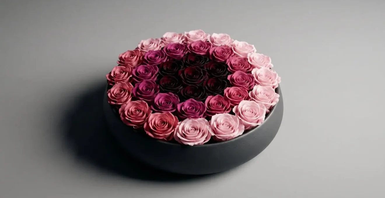
As you can see, the concentration of dark tones at the center creates an undeniable pull. The alternative strategy—placing dark colors at the perimeter—achieves a completely different result. It frames the composition, providing a strong visual anchor that makes the lighter, more ethereal colors in the center appear to glow. This is particularly effective for taller, more traditional vase arrangements, as it provides a stable visual base and prevents the design from feeling top-heavy.
Ultimately, the choice depends on the story you want your arrangement to tell: do you want to draw the viewer into a deep, intimate secret, or present a perfectly framed, radiant picture?
Dip Dyeing: How to Create a Custom Ombré on a White Rose?
While nature provides an incredible palette, sometimes the perfect transitional hue simply doesn’t exist. This is where the technical skill of dip-dyeing becomes an essential tool for the color specialist. Creating a custom ombré on a pristine white flower, like a rose, allows for ultimate control over the chromatic story. It enables you to create a gradient that is perfectly matched to a specific color theme, ribbon, or event décor. However, achieving a soft, seamless gradient—rather than a harsh, painted line—requires a precise, multi-step method.
The key is to work with varying concentrations of dye and to use water as a blending and stopping agent. A common mistake is to dip the flower into a single, dark dye bath, which results in a stark, unnatural edge. A professional approach involves a two-step saturation process, beginning with a very light base tint over the entire flower to eliminate the starkness of pure white. Then, a more concentrated solution is used to carefully color just the petal tips. A final, quick rinse is crucial; it halts the dye’s capillary action from wicking further up the petal, effectively “setting” the gradient.
When dyeing flowers, the quality of the dye itself is paramount. As noted by floral experts, using the right product is essential for the health of the bloom.
Professional floral dyes are specifically formulated to not clog the flower’s vascular system, ensuring the rose stays fresh longer.
– Windflower Florist, How To Dye Roses: 4 Easy Ways To Create Pretty Floral Colours
Your Action Plan: Professional Two-Step Saturation Method for Ombré Rose Dyeing
- Mix a very light dye solution (diluted concentration) and perform a quick 2-second full-flower dip to create a base tint.
- Prepare a concentrated dye solution in a separate container for the petal tips.
- Hold the rose by the stem and dip only the outer petal edges into the concentrated solution for 3-5 seconds to create the gradient.
- Immediately rinse the tips briefly in cool water to halt capillary dye wicking and prevent harsh lines.
- Apply a light mist of floral sealant to control bleed and preserve the gradient effect.
This level of customization is a signature of high-end floral design and a clear differentiator in a competitive market.
Lighting the Gradient: How to Capture Subtle Color Shifts on Camera?
Creating a beautiful ombré arrangement is only half the battle; capturing its subtle beauty on camera is a separate art form. Standard front-facing flash or harsh overhead light can flatten an arrangement, erasing the delicate transitions you worked so hard to create. To properly photograph a color gradient, you must think like a professional photographer and use light to reveal, not just illuminate. The most powerful technique for this is backlighting.
By placing your primary light source behind the subject, you cause the light to pass *through* the translucent petals. This technique makes the petals glow from within, revealing their delicate internal structures and every subtle shift in pigment that is invisible under direct light. It transforms the flower from an opaque object into a luminous vessel of color. As floral photography expert Kathy Roberts advises, this method leverages the natural properties of the blooms themselves.
Backlight is an excellent light for flower photography. When the sun is directly in front of you it will light the flower from behind and make the translucent petals glow.
– Kathy Roberts, 12 Pros share flower photography tips – Click Magazine
The goal is to showcase the translucency and delicate structure of the petals, which is where the magic of the color transition truly lies.
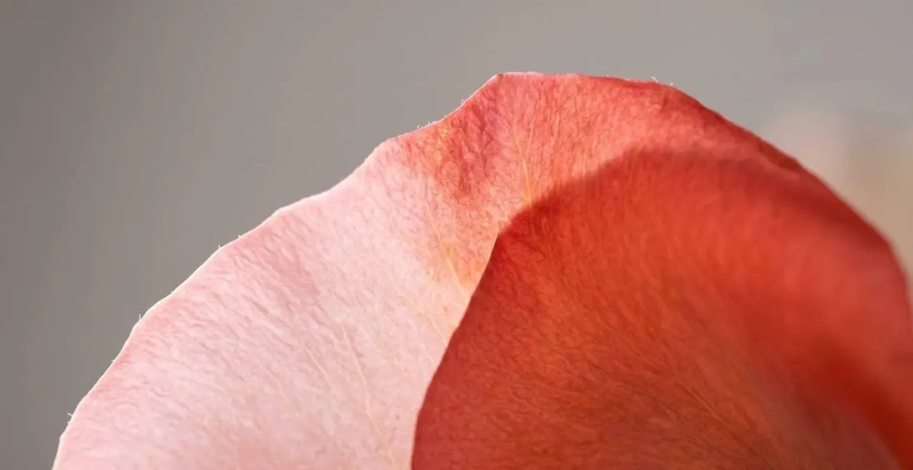
As this macro shot demonstrates, backlighting reveals the gradient at a microscopic level. To achieve this, you don’t need a complex studio. A simple setup with a window providing natural light behind the arrangement and a white card or reflector to bounce a small amount of fill light back onto the front can work wonders. The key is to ensure the backlight is the dominant source, creating that ethereal glow. Using a shallow depth of field (a low f-stop number on your camera) will also help to soften the background and draw all attention to the luminous color flow.
This photographic evidence not only builds a powerful portfolio but also helps clients understand the artistry and value of your work.
The Ombré Upsell: Why Clients Pay More for a Color Story?
An ombré arrangement is not just a bouquet; it is a demonstration of technical skill and artistic vision. This perceived value is why clients are willing to pay a premium. The ability to create a seamless color story signals a level of expertise that goes far beyond simply gathering pretty flowers. You are selling artistry, precision, and a custom creation. This justifies a price point that reflects not only the cost of goods but also the significant design expertise and labor involved in sourcing, planning, and potentially custom-dyeing elements for a flawless gradient.
A successful upsell is about education. You must articulate *why* an ombré design is more complex and valuable. Explain the concept of “bridge” flowers, which are often premium varieties like garden roses or ranunculus. If you’re using custom-dyed elements, highlight the bespoke nature of the work. By framing the conversation around artistry and customization, you shift the client’s mindset from cost per stem to investment in a unique piece of art. A tiered pricing structure can be an effective sales tool, clearly outlining what each level of investment provides in terms of gradient complexity and flower quality.
This table illustrates a clear strategy for pricing your ombré designs, directly linking complexity and flower choice to value. As this analysis of floral pricing strategies shows, tiered offerings empower clients to choose the level of artistry that fits their budget and vision.
| Tier Level | Gradient Complexity | Flower Quality | Typical Price Range | Key Features |
|---|---|---|---|---|
| Good | 3-shade gradient | Standard seasonal blooms (roses, carnations) | $75-$125 | Simple linear color progression, basic containers |
| Better | 5-7 shade gradient | Premium bridge flowers (coral ranunculus, garden roses) | $150-$300 | Sophisticated transitions, textured varieties, upgraded vessels |
| Best | Custom-dyed seamless gradient | Luxury flowers with coordinated dyed elements | $350-$600+ | Fully bespoke color story, artisan containers, custom ribbons, professional photography-ready |
When clients understand the chromatic story you are creating for them, they are not just buying flowers—they are commissioning art.
Cool Reds vs Warm Reds: Why They Clash and How to Fix It?
One of the most challenging tasks for a color specialist is managing undertones. Nowhere is this more apparent than with the color red. Placing a blue-based, cool red (like raspberry or some burgundy shades) next to a yellow-based, warm red (like poppy or tomato) often creates a jarring, unintentional clash. This happens because our eyes perceive the competing undertones as visual noise. They fight for dominance rather than harmonizing. Ignoring this sub-level of color theory is a common mistake that can undermine an otherwise well-structured design.
Fixing this clash isn’t about removing one of the reds, but about creating a deliberate bridge or buffer between them. The goal is to make the pairing feel intentional and sophisticated. You can achieve this by introducing a neutral buffer element, like the silvery-grey foliage of Dusty Miller or cream-colored roses. This creates a visual pause, allowing each red to be appreciated on its own terms. An even more advanced technique is to use a “bridge hue”—a complex color like a deep magenta or a dark, brownish-burgundy that contains both blue and yellow pigments, thereby harmonizing the two opposing reds.
To become proficient at this, you must first learn to identify the undertones accurately. Here are several professional techniques for identifying and harmonizing conflicting undertones:
- The Litmus Test: Place the red flower against a pure white surface or a true green leaf. Blue undertones will become more apparent, indicating a cool red, while orange or yellow casts reveal a warm red.
- Neutral Buffer Technique: Insert cream, beige, or silvery foliage between clashing reds to create visual separation and calm the palette.
- Bridge Hue Solution: Introduce deep burgundy or dark magenta flowers that contain both cool and warm tones to link and harmonize the conflicting undertones.
- Metallic Mediation: Weave in copper or gold accents. The metallic sheen acts as a sophisticated neutral that can make the pairing of warm and cool reds feel deliberate and luxurious.
By controlling the undertones, you demonstrate a deep mastery of color theory that sets your designs apart as truly professional.
Pink and Red: How to Make a Clashing Combo Look High Fashion?
The combination of pink and red has long been considered a stylistic faux pas, often evoking Valentine’s Day clichés. However, in the worlds of high fashion and contemporary design, this “clashing” combo is frequently used to create bold, energetic, and sophisticated statements. The key to transforming it from tacky to tasteful lies in moving beyond simple hue and manipulating three other crucial variables: value, texture, and proportion. A successful pink-and-red arrangement is a masterclass in controlled tension.
First, play with value. Instead of a medium pink and a medium red, pair a very pale, blush pink with a deep, dark burgundy. The high contrast in lightness and darkness creates a dynamic relationship that feels intentional and dramatic. Second, focus on texture. Combine the smooth, velvety petals of a red rose with the feathery, complex texture of pink astilbe or the glossy surface of an anthurium. The textural difference provides another layer of interest that distracts from the potential color clash. Finally, use proportion strategically. Don’t use a 50/50 split. Let one color dominate; for example, create a primarily red arrangement with just a few, deliberate pops of a vibrant, hot pink. This makes the “clash” feel like a confident, artistic accent rather than a mistake.
Another advanced technique is to introduce a third, unexpected “bridge” color in a small quantity. A touch of periwinkle blue, a sliver of chartreuse green, or even a hint of peach can completely re-contextualize the pink and red pairing. It breaks the binary relationship and signals to the viewer that this is a complex, considered palette. The goal is to show that you, the designer, are in complete control of the color story, purposefully breaking a “rule” to create something new and exciting.
This ability to find harmony in discord is the hallmark of a true color specialist, proving that in design, there are no bad colors—only uninspired combinations.
Key takeaways
- The secret to seamless ombré is using “bridge” flowers with natural multi-tonal pigments, not just lining up block colors.
- The placement of the darkest flowers—either at the center for depth or the edge for framing—is a strategic choice that controls the arrangement’s visual gravity and emotional focus.
- True mastery of color is demonstrated not just by blending different hues, but by creating sophisticated gradients within a single color family through variations in value (lightness and darkness).
chromatic theory
As we’ve explored various techniques, it becomes clear that true mastery of ombré design is rooted in a deep understanding of chromatic theory. It’s about recognizing that color has three distinct properties—hue (the color itself), saturation (its intensity), and value (its lightness or darkness)—and learning to manipulate each one independently. The most sophisticated and often most impactful form of ombré doesn’t even involve changing the hue. It is the monochromatic value gradient.
Creating a gradient using only shades and tints of a single color—from the palest blush pink to the deepest burgundy, for example—is a powerful statement. It demonstrates immense control and a refined eye. This approach forces the designer to focus purely on composition, texture, and form, as the color palette is intentionally restricted. The result is an arrangement that feels incredibly cohesive, elegant, and artistically deliberate. It is the ultimate expression of the “less is more” philosophy in floral design.
Case Study: Monochromatic Value Gradients in High-End Floral Design
Arena Flowers demonstrated the power of value-based ombré by creating a monochromatic pink mantelpiece installation using only variations in lightness and darkness of a single hue. The arrangement progressed from pale pink peonies and light scabiosa through medium rose-toned stocks to deep chocolate and burgundy peonies. By restricting the palette to value shifts rather than hue changes, the design achieved greater visual sophistication and cohesion. The case study revealed that this approach often proves more powerful than multi-color gradients because it demonstrates refined color control and creates a sense of intentional artistry rather than simply mixing ‘pretty colors together.’
By embracing the full spectrum of chromatic theory, you elevate your work from that of a decorator to that of a true color artist, capable of telling profound visual stories with the most subtle and powerful tool you have: color itself.