Winning at avant-garde floral design isn’t about randomly breaking rules; it’s about mastering a new set of rules rooted in fine art and intentional disruption.
- Successful designs treat flowers not just as blooms, but as sculptural elements of texture, line, and form.
- The structure, whether metal or the stems themselves, can become the primary subject, with flowers serving as calculated accents.
- Mastery of negative space, textural contrast, and even the “ugly” stages of a flower’s life are what separate professional work from amateur attempts.
Recommendation: Stop trying to be “different” and start being “intentional.” Analyze every element’s purpose and its contribution to the overall sculptural narrative.
As a floral judge, I see hundreds of arrangements a year. The vast majority are technically proficient, beautiful, and utterly forgettable. They are what the industry affectionately, and dismissively, calls “roundy-moundy” bouquets—safe, symmetrical, and lacking a point of view. In the competitive arena, “pretty” is the baseline; it is not the goal. Many designers believe the path to avant-garde is to simply break the established rules of floristry, leading to chaotic compositions that mistake messiness for meaning. They might add a strange branch or use a peculiar color, but these are often superficial gestures.
The truth is that avant-garde design is not the absence of rules; it is the mastery of a more sophisticated set. It’s a discipline built on principles borrowed from sculpture, painting, and architecture. It requires a fundamental shift in perspective: from arranging flowers to sculpting with botanical materials. The goal is not just to be different, but to create an intentional disruption—a piece so deliberate in its choices that it forces the viewer to see flowers in an entirely new light. A truly competitive piece can articulate *why* it leans, *why* it’s painted, and *why* a dead leaf is more powerful than a perfect rose.
This guide is designed to give you, the aspiring competitor, a look inside the judging process. We will move beyond the platitudes and deconstruct the core techniques that signal mastery in avant-garde floral art. By understanding the ‘why’ behind these advanced concepts, you can begin to build arrangements that are not just visually striking, but conceptually sound and worthy of the highest accolades.
To help you navigate these advanced concepts, this article breaks down the essential pillars of avant-garde floral construction. From the physics of balance to the philosophy of decay, each section provides a framework for elevating your work from decorative to declarative.
Summary: Deconstructing Avant-Garde Floral Concepts
- Dynamic Balance: How to Balance a Design That Leans Heavy to One Side?
- Metal Frameworks: How to Build a Shape That Dictates the Flowers?
- Soft and Prickly: Pairing Wool and Thistles for Tactile Shock
- Parallel Design: How to Make Stems Look Like Bars of a Cage?
- The Ugly Beautiful: Why Dead Flowers Can Be Avant-Garde?
- Spray Paint and Dye: Is Painting Flowers Art or Sacrilege?
- Negative Space in Linear Design: Why the Void Is as Important as the Flower?
- Abstract Botanical Sculpting: When Flowers Become Texture and Form
Dynamic Balance: How to Balance a Design That Leans Heavy to One Side?
The first sign of an amateur is a fear of asymmetry. The instinct is to create a design that is perfectly mirrored, stable, and visually safe. A master, however, understands that dynamic tension is far more engaging. An asymmetrical design that leans heavily to one side but doesn’t topple creates a sense of movement and energy that symmetrical designs lack. The secret to achieving this is not a disregard for balance, but a deeper understanding of it through the principle of visual weight. This concept is gaining traction, with a recent survey showing that 68% of floral professionals now prioritize texture and form over simple color arrangements, indicating a shift towards more sculptural thinking.
Visual weight isn’t about physical mass; it’s about an element’s perceived heaviness. Dark colors are heavier than light colors. Large, solid shapes are heavier than delicate, airy ones. A single, dramatic crimson amaryllis can balance a larger grouping of pale, feathery astilbe. As a judge, I look for this deliberate counterbalancing. It’s a visual conversation where a small, dense element on one side holds its own against a large, open element on the other. As one educational guide explains, this principle is foundational.
Visual weight is a flower’s perceived lightness or heaviness based on its color, shape, and pattern. Varying visual weight helps achieve the compensation or counterbalancing in asymmetrical designs.
– New Mexico FFA Floriculture Education, Understanding the Principles of Floral Design
Mastering this requires you to squint, to see your materials not as flowers but as patches of color and density. Does the large, dark void under a leaning branch feel balanced by a small, bright point of interest near the base? This is the calculation that turns a precarious lean into a breathtaking dance of forces.
Action Plan: Auditing Your Asymmetrical Balance
- Points of Contact: Identify all points of visual “heaviness.” List them out: a dark flower, a dense cluster of leaves, a large piece of foliage, a block of negative space.
- Assign Weight: On a scale of 1-5, rate the perceived visual weight of each element you listed. A dark, solid dahlia might be a 5, while a sprig of baby’s breath is a 1.
- Map the Fulcrum: Locate the visual center of your arrangement. Are your heavy elements clustered on one side? Is there a corresponding, lighter-but-deliberate element on the other side to act as a counterweight?
- The Squint Test: Step back and squint your eyes until the arrangement blurs into shapes and colors. Does it feel like it’s tipping over, or is there a sense of resolved tension? The blur removes the identity of the flower and reveals its true weight.
- Justify the Void: If you have a large empty space, ask yourself: is it just empty, or is it an active counterweight? A void can have immense visual weight if it’s framed correctly. Justify its presence.
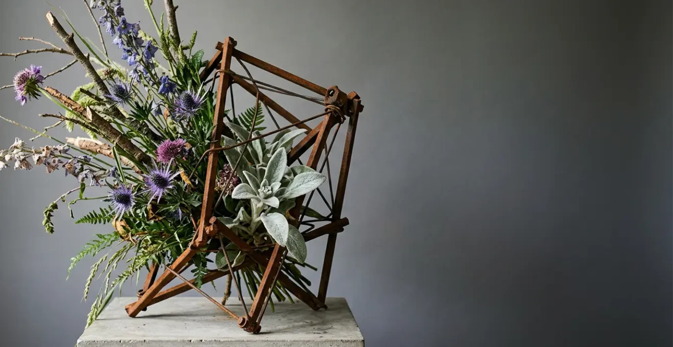
Metal Frameworks: How to Build a Shape That Dictates the Flowers?
In traditional floristry, the container and mechanics are there to be hidden. The flowers are the star. In avant-garde sculpture, the framework can become the main event. This approach involves a radical shift in hierarchy: you are not using a structure to support the flowers; you are using flowers to adorn a structure. The shape of the metal armature, its lines, and its texture dictate the entire composition. The flowers become jewels, placed with surgical precision to highlight a curve or create a focal point on the sculpture itself.
This idea is not new; it has deep roots in the mid-20th century art world. By studying these movements, you arm yourself with a conceptual language to explain your choices to a judge, proving your work is historically informed, not just a random collection of parts.
Case Study: Brutalist Floral Sculpture
Mid-century Brutalist artists like Curtis Jere pioneered the integration of torch-cut metal, rusted steel, and copper frameworks as primary sculptural elements. Their work in the 1960s and 1970s demonstrated how a metal armature could be a celebrated skeleton, not a hidden secret. In these pieces, flowers are minimal accents. A single orchid might be placed to contrast with the rough, welded steel, creating a powerful dialogue between the permanent, industrial material and the ephemeral, delicate botanical. The form is born from chaos, with bold, flame-cut manipulation shaping metal into a dominant presence that the flowers must obey.
To work this way, you must think like a sculptor first and a florist second. Build or choose a framework—welded rebar, woven copper wire, a found piece of industrial metal—that has its own integrity and beauty. Let its form guide you. The negative spaces within the metal are as important as the metal itself. Your job is not to fill these spaces, but to use a minimal number of perfectly chosen botanicals to draw the eye to the structure’s most interesting features. This restraint is a hallmark of mastery.
Soft and Prickly: Pairing Wool and Thistles for Tactile Shock
Avant-garde design seeks to engage more than just the eye; it aims for a full sensory and psychological response. One of the most powerful and underutilized tools in a designer’s arsenal is the evocation of touch. We can achieve this through a concept I call haptic empathy: creating such an extreme visual contrast in texture that the viewer feels a ghost sensation of touching it. Your hand instinctively recoils from the sharp and yearns to stroke the soft, all without any physical contact.
Simply placing a smooth leaf next to a rough one is not enough. The competition stage demands a more dramatic, almost shocking, juxtaposition. Imagine the extreme: the cloud-like, gentle billows of raw merino wool pressed directly against the sharp, defensive armor of a thistle. This isn’t just contrast; it’s a narrative. It’s comfort and pain, invitation and warning, all held in a single, tense composition. The goal is to make the viewer’s brain fire on a primal, tactile level.

As you can see, the power is in the precision of the meeting point. It’s not a casual mix but a deliberate confrontation. When I judge a piece that employs this technique, I am looking for commitment. Did the designer go all the way? Is the softness truly, unbelievably soft-looking? Is the sharpness genuinely threatening? Mediocrity in textural contrast is a fatal flaw. You must source materials that are the epitome of their tactile quality—the glossiest leaf, the most gnarled bark, the most velvety petal, the sharpest thorn. It is this dedication to textural extremes that creates a memorable, visceral experience for the viewer and a high score from the judges.
Parallel Design: How to Make Stems Look Like Bars of a Cage?
Parallel design is a technique where stems are placed in a parallel manner, each maintaining its own vertical or horizontal trajectory. In its basic form, it’s a simple exercise in order. But in the hands of an avant-garde artist, it becomes a powerful tool for narrative and conceptual expression. By transforming the stems into a dominant visual element, you can evoke complex themes like order, confinement, structure, and rhythm. The ultimate expression of this is making the stems look like the bars of a cage.
This is not about trapping flowers. It is about creating a visual tension between the strong, rigid lines of the “bars” and whatever lies within or between them. That “caged” element could be a single, precious bloom, suggesting protection or imprisonment. Or, even more powerfully, the space between the bars could be empty, forcing the viewer to contemplate the void itself. The stems cease to be simple conduits for water and become architectural or sculptural lines that define the entire piece.
Case Study: The Narrative Power of Parallel Systems
Contemporary florists have elevated parallel design into a narrative device. Using linear materials like gladioli, liatris, or equisetum in strict alignment, designers create architectural structures. As noted in a recent analysis of contemporary techniques, different basing methods like pavé (a tight, cobblestone-like clustering) or terracing (stair-step layering) can be used to secure the stems. This transforms functional stems into conceptual statements about containment and order. The result is a design where the lines themselves tell a story, creating a palpable tension between the structure and the space it defines.
As a judge, when I see a parallel design, I am looking beyond the neatness. I am asking: what is the purpose of this order? Is it creating a calming rhythm, or a sense of anxious confinement? The most successful pieces use the parallel stems to frame a story. For example, a “cage” of black equisetum with a single, blood-red rose inside tells a very different story from a “screen” of green bear grass shielding a delicate cluster of lily of the valley. The technique is the medium, but the narrative is the message.
The Ugly Beautiful: Why Dead Flowers Can Be Avant-Garde?
Our culture is obsessed with youth and perfection, and this is reflected in floristry’s preference for the perfect, unblemished bloom at its peak. This is precisely why the most radical and profound statement you can make as a designer is to embrace the beauty of decay. Using dead, dying, or “ugly” materials—seed pods, withered leaves, browning petals, gnarled branches—is a direct challenge to convention. It’s a philosophical stance that finds beauty in the entire life cycle, not just one fleeting moment of perfection.
This is not about being messy or morbid. It is about revealing the incredible textural and structural complexity that emerges as a flower fades. A dried poppy seed pod has a sculptural integrity that a fresh poppy lacks. The papery, translucent skin of a faded hydrangea has a subtlety that its bright, youthful version cannot match. This aesthetic, often associated with the Japanese concept of Wabi-sabi, celebrates the imperfect, the impermanent, and the incomplete. It is a quiet, confident statement that requires immense skill to pull off. It’s easy to make something beautiful with a perfect rose; it takes an artist to reveal the beauty in a dead one.
The key is to present these materials with the same reverence and care as a perfect bloom. They are not filler; they are the subject. As one floral artist eloquently puts it, the later stages of a plant’s life are a feast for the senses.
As blooms burst into seeds and pods, vines, berries and flowers dapple with new antique color, and leaves crinkle and curl as they dry, we experience a visual buffet.
– The Floral Coach, Adding Texture & Dimension With Seasonal Flowers
When I see a design that successfully uses decaying elements, I see a designer with confidence and depth. They are not just arranging flowers; they are telling a story about time, life, and beauty in unexpected places. They understand that a crinkled, brown leaf can have more character and emotional resonance than a dozen pristine green ones.
Spray Paint and Dye: Is Painting Flowers Art or Sacrilege?
Perhaps no technique is more divisive in the floral world than altering a flower’s natural color. To purists, it is sacrilege—an attempt to “fix” what nature has already perfected. But from an avant-garde perspective, a flower is no more sacred than a lump of clay or a tube of paint. It is raw material. Painting a flower is not about improving it; it is about transforming it. It’s an act that removes the flower from the context of “nature” and places it squarely in the context of “art.”
This practice forces the viewer to question their own notions of authenticity and beauty. A metallic gold anthurium or a baby-blue carnation is jarring, hyper-real, and undeniably artificial. It stops being a botanical specimen and becomes a pure object of color and form. This is a powerful move, aligning the work with major art movements like Pop Art, which celebrated the mass-produced and the artificial, or Postmodernism, which delights in questioning what is real.
Case Study: The Painted Floral Movement of Brrch Floral
Pioneered by artists like Brittany Asch of Brrch Floral, the act of painting flowers has been reframed as a legitimate artistic practice. In an article highlighting florists leading a new wave of design, her work is shown as treating blooms as three-dimensional canvases. Her hand-dyed or spray-painted creations, which often feature hyper-real or impossible hues, are not intended to fool the eye. Instead, the very act of painting becomes a commentary on naturalness itself, challenging our expectations and placing the flower in a new, strange, and compelling context.
As a judge, the question is never “is painting flowers wrong?” but “why was this flower painted?” If the color is simply used to match a client’s decor, it is commercial work. But if the color is used to make a conceptual point—to create an unnerving, otherworldly landscape, or to unify disparate elements into a single monochromatic sculpture—then it is art. The goal, as one designer puts it, is to find a delicate equilibrium.
I am infinitely inspired by the bizarre and am constantly working to emulate a fine balance between an aesthetic that is beautiful and pleasing, but equally strange and unexpected.
– Jaime McCuaig, Gunnar Floral
Negative Space in Linear Design: Why the Void Is as Important as the Flower?
In Western design, we are taught to fill space. An empty corner feels awkward; a blank wall feels unfinished. The revolutionary concept of negative space, drawn heavily from Eastern aesthetics like Ikebana, proposes the opposite: the void is not empty. It is a tangible, active element of composition. In a linear floral design, the spaces between your branches, stems, and flowers are as important as the materials themselves. This is the ultimate test of restraint and confidence.
A linear design is defined by strong lines and a minimal use of materials. Here, the placement of each element is critical because it is not just adding a stem; it is carving up the surrounding space. You are creating an “activated void.” A well-placed line energizes the emptiness around it, creating tension, direction, and focus. An empty area in a design can give the eye a place to rest, making the elements that *are* present more impactful. It can create drama, suggest a vast landscape, or evoke a feeling of calm and serenity.
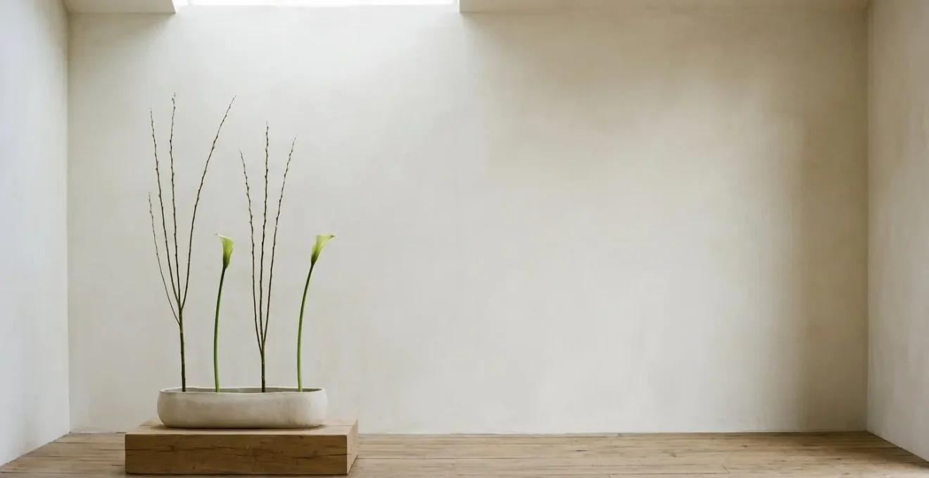
Look at the composition above. The design’s power comes not from what is there, but from what isn’t. The vast, open space on the right is not a flaw; it is the point. It counterbalances the weight of the sparse arrangement on the left, creating an asymmetrical harmony that is both sophisticated and profound. This is what judges look for: not just beautiful lines, but the beautiful spaces those lines create. It demonstrates an understanding that you are designing the entire volume of the piece, not just the physical objects within it.
To master this, you must fight the urge to add more. When you place a stem, step back and observe how it changes the shape of the air around it. The true art lies in placing the fewest possible elements to create the most impactful and meaningful composition. Anyone can fill a vase; an artist knows when to stop.
Key takeaways
- Intentionality Over Rules: Avant-garde success lies not in breaking rules, but in deliberately applying new ones from fine art and sculpture.
- Material Hierarchy is a Choice: You can and should decide whether the flower is the subject or merely an accent to a dominant structure.
- Evoke, Don’t Just Show: The goal is a psychological or sensory reaction, using tools like tactile contrast and the beauty of decay to tell a deeper story.
- The Void is a Material: Negative space is an active, powerful element that you must design with as much care as your physical components.
Abstract Botanical Sculpting: When Flowers Become Texture and Form
We arrive at the final frontier of avant-garde floristry: the complete deconstruction of the flower. This is the point where a flower ceases to be identified as a “flower” at all and is instead seen as a source of raw material. A rose is no longer a rose; it is a source of red pigment, velvety texture, and curved lines. A lily is a source of white, a strong vertical line, and a dusting of pollen. This is abstract botanical sculpting, and it is the ultimate expression of creative transformation.
In this practice, you might dissect a flower into its constituent parts—petals, stamens, pistils—and reassemble them in a completely new, non-floral form. You might mass hundreds of a single type of leaf to create a solid, textured surface that no longer looks like leaves. The identity of the original plant is deliberately obscured to create something entirely new. The goal is to force the viewer to see the material for its pure formal qualities: its color, its texture, its shape, its line.
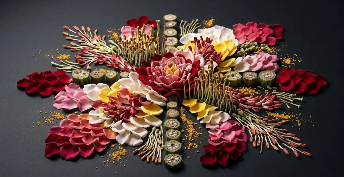
This is the most conceptually challenging work, and it is what truly separates the designer from the artist. It requires you to look at a tulip and see a unit of color, to look at a branch and see a line, to look at a seed pod and see a geometric solid. As a judge, seeing this level of abstraction is exhilarating. It signals a designer who has moved beyond arranging and is now truly creating, using botanical media to explore the fundamental principles of art. This drive for a unique viewpoint is a powerful force in contemporary design.
Instagram has contributed much to the proliferation of this movement. When you see a lot of the same as a designer, you push yourself to think outside the box and explore more of what your point of view on flowers is.
– Natasa Kajganic, Flower Market Toronto
This final stage is about developing your unique artistic voice. It is less about technique and more about vision. What can you make a flower do that no one has ever seen before? How can you use these natural materials to create an object of pure, abstract beauty?
By mastering these principles—from dynamic balance to abstract sculpting—you are no longer just a florist. You are a sculptor, a painter, and a storyteller whose medium happens to be alive. To truly excel in competition, you must internalize this mindset. Move beyond creating arrangements and begin crafting arguments. Each piece should be a thesis, a confident declaration of your unique artistic vision, built on a foundation of intent, control, and profound respect for your materials in all their forms. This is how you move beyond the roundy-moundy and into the winner’s circle.