Colors & Harmony
When a florist arranges roses beside dahlias, or a decorator pairs soft blush linens with deep burgundy centerpieces, they’re navigating one of design’s most powerful yet misunderstood territories: color harmony. Unlike fashion or graphic design, floral color work operates under unique constraints. Living materials fade, lighting changes throughout an event, and cameras capture blooms differently than human eyes perceive them.
Color harmony in floral and decorative design isn’t just about choosing pretty combinations. It’s a systematic approach that blends color theory, psychology, environmental awareness, and practical technique. The difference between a bouquet that feels “off” and one that captivates often comes down to understanding value contrast, saturation balance, and strategic color distribution rather than simply selecting trendy hues.
This comprehensive exploration unpacks the foundational principles that transform random color choices into intentional, impactful design. From the mechanics of complementary schemes to the emotional weight of specific palettes, from managing difficult color pairings to adapting for photography, you’ll gain the framework to make confident color decisions in any floral or decorative context.
Color Theory Foundations in Floral Design
Color wheels and harmony models aren’t abstract academic concepts—they’re practical tools that predict which combinations will create visual tension, balance, or drama. Understanding these frameworks allows designers to move beyond trial-and-error and create intentional emotional responses.
Complementary and Split-Complementary Schemes
Complementary colors sit opposite each other on the color wheel (orange and blue, red and green, yellow and purple), creating maximum contrast and visual vibration. In floral work, this can make arrangements pop against backgrounds—think white peonies against a navy wall, or how orange ranunculus intensifies beside purple anemones. The drama is undeniable, but too much equal saturation between complements can feel jarring rather than sophisticated.
Split-complementary schemes offer a more nuanced approach. Instead of using a color’s direct opposite, you select the two colors adjacent to its complement. Pairing orange with blue-violet and red-violet, for example, maintains tension while introducing variation that feels more refined than aggressive.
Monochromatic and Tetradic Approaches
A monochromatic palette restricts the design to variations of a single hue—different values and saturations of green, for instance. White and green arrangements demonstrate how powerful this restraint can be, creating sophistication through subtle gradations rather than chromatic diversity. The challenge lies in incorporating enough value contrast to prevent the design from reading as flat.
Tetradic (four-color) harmonies use two sets of complementary pairs, creating complex, vibrant palettes that require careful proportion management. Without a dominant color and clear hierarchy, these schemes can feel chaotic. The key is treating one color as the star (approximately 60% of visual weight), two as supporting players (30% combined), and one as strategic accent (10%).
Value Contrast: The Hidden Power of Light and Dark
Amateur designers obsess over hue—whether to use pink or peach, lavender or purple. Experienced designers obsess over value: the relative lightness or darkness of those colors. A palette can have perfect color harmony according to the wheel yet still fail if the values are too similar.
Why Value Trumps Hue
Place light pink roses beside pale peach ranunculus and soft lavender sweet peas, and despite using different hues, the arrangement may lack definition. The flowers blur together visually because their values are nearly identical. Now replace just one element with a deep burgundy dahlia—suddenly the entire composition gains structure and focal points.
Dark foliage serves this function brilliantly. Copper beech leaves, for instance, make jewel-tone flowers like ruby dahlias or sapphire delphiniums appear more luminous through contrast. The dark background provides a stage that elevates the performers.
Strategic Placement and Lighting Challenges
The placement of dark versus light flowers follows competing philosophies. Positioning the darkest blooms at the arrangement’s center creates a gravitational focal point that draws the eye inward. Placing them at the edges creates depth and framing, making lighter interior flowers appear to glow. Neither is universally correct; the choice depends on the desired visual effect and viewing context.
Lighting conditions dramatically affect value perception. Dark flowers that appear moody and sophisticated in daylight can virtually disappear under dim evening lighting or candlelight. For nighttime events, either boost the quantity of dark blooms to maintain visibility or incorporate lighter tonal variations.
Solving Color Clashes with Bridge Tones
Some color pairings feel inherently wrong: certain pinks beside certain reds, or warm reds clashing with cool reds. These aren’t incompatible by universal law—they’re simply combinations that lack a visual connector, a transitional element that helps the eye move comfortably between them.
The concept of a bridge color transforms seemingly impossible pairings into high-fashion statements. When pink and red clash, it’s often because one leans warm (peachy-pink with orange undertones) while the other leans cool (raspberry-red with blue undertones). Introducing a transitional tone—coral, which contains both pink and red-orange, or a mauve that bridges pink toward purple and then toward cooler reds—creates a gradient that legitimizes the combination.
Specific flowers serve as natural bridges. When connecting pink to orange, blooms like salmon-toned roses, peachy ranunculus, or apricot spray roses provide the stepping stones. The key is ensuring the bridge flower shares visual characteristics with both endpoint colors, creating a logical progression rather than three competing hues.
Cool reds and warm reds clash because they’re actually different color families forced under one name. Cool reds (crimson, raspberry, magenta) contain blue undertones; warm reds (scarlet, vermillion, tomato) contain yellow-orange undertones. The solution is either committing fully to one temperature or using a true neutral red as the bridge.
Saturation Levels and Color Proportion
Hue and value aren’t the only variables that determine harmony. Saturation—the intensity or purity of a color—plays an equally critical role. High-saturation colors (neon, jewel tones) demand attention. Low-saturation colors (pastels, muted tones) recede and soothe.
The Pastel-Neon Dilemma
Mixing saturation levels without strategy is one of the fastest ways to create visual confusion in a bouquet. Pastel sweet peas beside neon gerbera daisies creates competition rather than harmony—each saturation level undermines the other. The pastels look washed out; the neons look garish. Neither gets to fully express its character.
This doesn’t mean you can’t combine saturation levels—it means doing so requires intention and proportion. If the design concept calls for bold, saturated flowers, pastels should appear as minimal accents rather than equal partners. Conversely, in a predominantly pastel palette, a single high-saturation bloom can serve as a strategic focal point if it’s clearly the intentional star.
The 60-30-10 Distribution Rule
Color proportion follows a guideline borrowed from interior design: the 60-30-10 rule. Approximately 60% of the visual composition should feature the dominant color, 30% a secondary supporting color, and 10% an accent. This creates hierarchy and prevents the “everything competing for attention” phenomenon.
In a bouquet, this might translate to 60% soft ivory roses (dominant), 30% sage eucalyptus foliage (secondary), and 10% deep burgundy ranunculus (accent). Chromatic gradation techniques like ombré arrangements take this further, creating smooth transitions from light to dark through deliberate proportion shifts that maintain visual flow.
Color Psychology and Emotional Resonance
Colors don’t just look different—they feel different. Decades of psychological research confirm that specific hues trigger measurable emotional and physiological responses. For event designers and floral stylists, this transforms color from a purely aesthetic choice into a strategic communication tool.
Yellow, for instance, correlates strongly with joy, optimism, and energy across most cultures. Incorporating sunflowers, Billy balls, or yellow ranunculus into event florals can genuinely influence guest mood, creating a more uplifted, sociable atmosphere. This isn’t mysticism—it’s neuroscience, as color perception activates specific brain regions associated with emotion and memory.
Brand and corporate design leverages these psychological associations deliberately. Blue palettes communicate trust, stability, and professionalism, explaining its dominance in financial and healthcare institutions. Conversely, bright, energetic palettes featuring oranges, magentas, and lime greens signal confidence, creativity, and boldness—appropriate for innovative tech companies but potentially inappropriate for luxury brands seeking to convey sophistication.
For florists working with clients, understanding these psychological dimensions helps navigate challenging conversations. When a bride insists on soft pastels but her personality suggests bold, saturated colors, you’re not just managing aesthetic preference—you’re helping align visual language with authentic identity. The palette should say what the client wants to communicate, whether that’s “romantic and dreamy” or “bold and unforgettable.”
Environmental Factors That Alter Perception
Color exists only in context. The same bouquet can appear dramatically different depending on surrounding surfaces, lighting conditions, and even the medium through which it’s viewed. Anticipating these environmental factors prevents disappointing surprises.
Reading Room Undertones
Before selecting a floral palette for a specific venue or room, designers must assess the space’s undertone temperature. Does the lighting cast a warm (yellow-golden) or cool (blue-gray) glow? Are the walls, linens, and surfaces warm-toned (cream, beige, warm gray) or cool-toned (white, blue-gray, cool taupe)?
Placing cool-toned flowers (lavender, blue hydrangea, pure white) in a warm-toned room with golden lighting can cause them to appear dingy or off-color. The solution isn’t avoiding these combinations entirely but rather adjusting saturation, adding bridge tones, or incorporating neutrals that harmonize both temperatures.
Photography and Digital Sensors
Digital cameras and human eyes process color differently, creating a significant challenge for event florals that will be extensively photographed. Highly saturated reds, in particular, tend to “blow out” in photos—they oversaturate the sensor, losing detail and appearing as flat blocks of color rather than dimensional flowers with texture and depth.
Photographers often request florists adjust red-heavy palettes by incorporating burgundy, wine, or red with purple undertones instead of pure scarlet. Alternatively, balancing saturated reds with plenty of neutral whites, creams, or greens helps cameras process the scene more accurately. For social-media-focused events, testing how the palette photographs under the actual venue lighting before the event date prevents costly disappointments.
Artificial Color Enhancement: Art or Compromise?
The availability of spray-painted and dyed flowers raises philosophical and practical questions. When natural flowers don’t exist in the desired color—true blue roses, metallic gold dahlias, or perfectly matched corporate Pantone colors—artificial color manipulation offers solutions. But at what cost?
Purists argue that altering a flower’s natural color violates the integrity of floral design, prioritizing artificial aesthetics over botanical authenticity. The counter-argument holds that floral design is art, and artists have always used available tools to realize creative visions. Spray paint and dye expand the color palette beyond biological limitations, enabling precise brand matching and fantastical color stories impossible with natural materials alone.
The practical reality is context-dependent. For corporate events requiring exact brand color matching, dyed flowers may be the only viable solution. For weddings seeking specific aesthetics (metallic accents, trending colors not found in nature), enhancement techniques offer creative freedom. The key is quality execution—poorly dyed flowers with streaky petals and stained stems look cheap and detract from the design.
Transparency matters too. Clients should know when flowers are enhanced rather than natural, allowing them to make informed decisions aligned with their values and budget. Some enhancement techniques are significantly more expensive than simply choosing different flowers, making the conversation both aesthetic and financial.
Color harmony in floral and decorative design emerges from the intersection of technical knowledge, psychological insight, and environmental awareness. Understanding color theory provides the vocabulary and frameworks; recognizing value and saturation dynamics creates visual impact; bridge tones solve seemingly impossible pairings; and proportion rules prevent chaos. But theory alone doesn’t make great design—application requires considering lighting conditions, photography requirements, room undertones, and the emotional messages colors carry. Mastering these principles transforms intuitive guessing into confident, intentional design that consistently delivers emotional and visual impact.
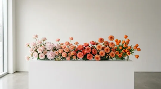
Chromatic Gradation: The Art of Ombré Floral Design
In summary: Mastering ombré goes beyond lining up colors; it’s about understanding color theory to tell a visual story. Success lies in using “bridge” flowers with natural multi-tonal pigments to create seamless transitions. The placement of your darkest blooms dictates…
Read more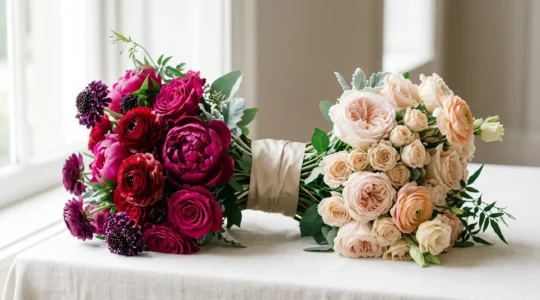
Bold Palettes: How to Sell Bright Colors to Pastel-Loving Brides?
The key to selling bold color is shifting from vendor to consultant; it’s not about persuasion, but education on the principles of color architecture and branding. Success with bold palettes relies on mastering technical aspects like lighting (uplighting), foliage contrast,…
Read more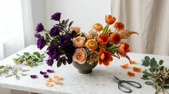
How to Create Vibrant Floral Palettes That Don’t Look Chaotic?
Contrary to basic design advice, mastering vibrant floral palettes has little to do with the color wheel and everything to do with controlling three hidden variables. Saturation creates visual weight and focal points. Value (lightness/darkness) adds depth and prevents ‘color…
Read more