Contrary to basic design advice, mastering vibrant floral palettes has little to do with the color wheel and everything to do with controlling three hidden variables.
- Saturation creates visual weight and focal points.
- Value (lightness/darkness) adds depth and prevents ‘color mud’.
- Transitional ‘bridge tones’ are the key to connecting clashing hues.
Recommendation: Start by analyzing the saturation of your flowers, not just their hue, to build a professional-grade palette.
As a florist or floral enthusiast, you’ve likely felt the frustration. You want to move beyond the safety of all-white or soft pastel bouquets and create something truly vibrant and memorable. Yet, when you try to mix bold, exciting colors, the result often feels less like a masterpiece and more like a chaotic mess. You’ve studied the color wheel, you understand complementary and analogous schemes, but applying that theory to the complex, multi-toned world of living flowers feels like a different challenge altogether. The standard advice seems to fall short, leaving your arrangements feeling either timid or visually jarring.
The common approach is to stick to rigid rules learned in a basic art class or to use vast amounts of white and green foliage as a crutch to separate clashing colors. This can lead to predictable and uninspired designs. But what if the secret to creating sophisticated, dramatic palettes isn’t found in simply repeating color wheel formulas? What if the true mastery lies in understanding the hidden variables that professionals manipulate? The key isn’t just the hue (the color itself), but a trio of dynamic properties: saturation (the color’s intensity), value (its lightness or darkness), and performance (how it changes under light).
This is where floral design transcends simple rules and becomes an art of deliberate control. By mastering these chromatic variables, you can pair seemingly clashing colors with confidence, build visual depth, and design an emotional journey for the viewer. This guide will deconstruct these professional techniques, moving you from a decorator who follows rules to a color theorist who directs the eye and evokes emotion. We will explore advanced harmonies, the critical role of lighting, and the precise science behind creating palettes that are both bold and beautifully balanced.
This article provides a structured path to elevate your understanding of color. Each section builds upon the last, offering professional insights and practical tools to transform your approach to floral composition.
Summary: Creating Intentional and Vibrant Floral Palettes
- Split-Complementary Schemes: How to Pair Orange and Purple for Drama?
- Pastel vs Neon: Why Mixing Saturation Levels Ruins a Bouquet?
- The Bridge Color: How to Connect Clashing Hues with a Transitional Tone?
- Daylight vs Candlelight: How Venue Lighting Changes Your Color Palette?
- Yellow and Joy: Does Color Really Influence Guest Mood at Events?
- Bridge Colors: Which Flowers Connect Pink to Orange Seamlessly?
- Four Color Harmony: How to Balance a Complex Tetradic Palette?
- Chromatic Theory: The Final Step to Professional Mastery
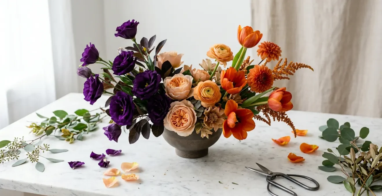
Split-Complementary Schemes: How to Pair Orange and Purple for Drama?
While a direct complementary pairing (like orange and blue) offers maximum contrast, it can sometimes feel harsh or unsophisticated in floral design. The split-complementary scheme is the professional’s secret weapon for achieving high-impact drama with more nuance. This harmony takes a base color and pairs it not with its direct opposite, but with the two colors adjacent to its opposite. For example, instead of pairing orange with blue, you would pair it with blue-green and blue-violet. This creates a similar tension but with a more complex and harmonious visual story.
The success of this scheme lies in its inherent balance. It provides strong visual contrast without the direct opposition that can feel jarring. As floral professionals have demonstrated, this approach allows a designer to maintain powerful color drama while achieving a more sophisticated and gentle appeal. It’s the perfect strategy when you want the impact of a complementary palette but with greater elegance. The key to preventing chaos in this vibrant scheme is to establish a clear hierarchy.
A proven method is the 60-30-10 rule. Your dominant color (e.g., a deep aubergine purple) should constitute about 60% of the arrangement’s visual mass. The main accent color (a vibrant burnt orange) should make up 30%. The final 10% is reserved for a transitional tone (like a muted peach or soft lilac) that bridges the two main colors and controls the drama. Furthermore, playing with value—pairing a deep, low-saturation purple with a bright, high-saturation orange—adds another layer of depth and visual interest.
Pastel vs Neon: Why Mixing Saturation Levels Ruins a Bouquet?
The single most common mistake that leads to chaotic bouquets is the uncontrolled mixing of saturation levels. Saturation refers to the intensity or purity of a color. A high-saturation color is vivid and pure (like a neon pink), while a low-saturation color is muted or softened with gray, white, or black (like a dusty rose). When these are mixed without intention, they compete for attention and create visual confusion. The eye doesn’t know where to look, and the palette feels accidental rather than designed. This is because high-saturation colors have a greater visual weight; they naturally pull the viewer’s focus.
This principle of visual weight is not a flaw but a powerful tool when used correctly. Instead of randomly scattering vibrant and pastel flowers, a professional designer uses saturation to create a clear focal point and guide the eye. A single, high-saturation bloom placed strategically at the heart of an arrangement, surrounded by flowers of lower saturation, will instantly become the star. The surrounding muted tones act as a supporting cast, enhancing the hero color without competing with it. This creates a composition with clear direction and depth, where the energy is focused and intentional.
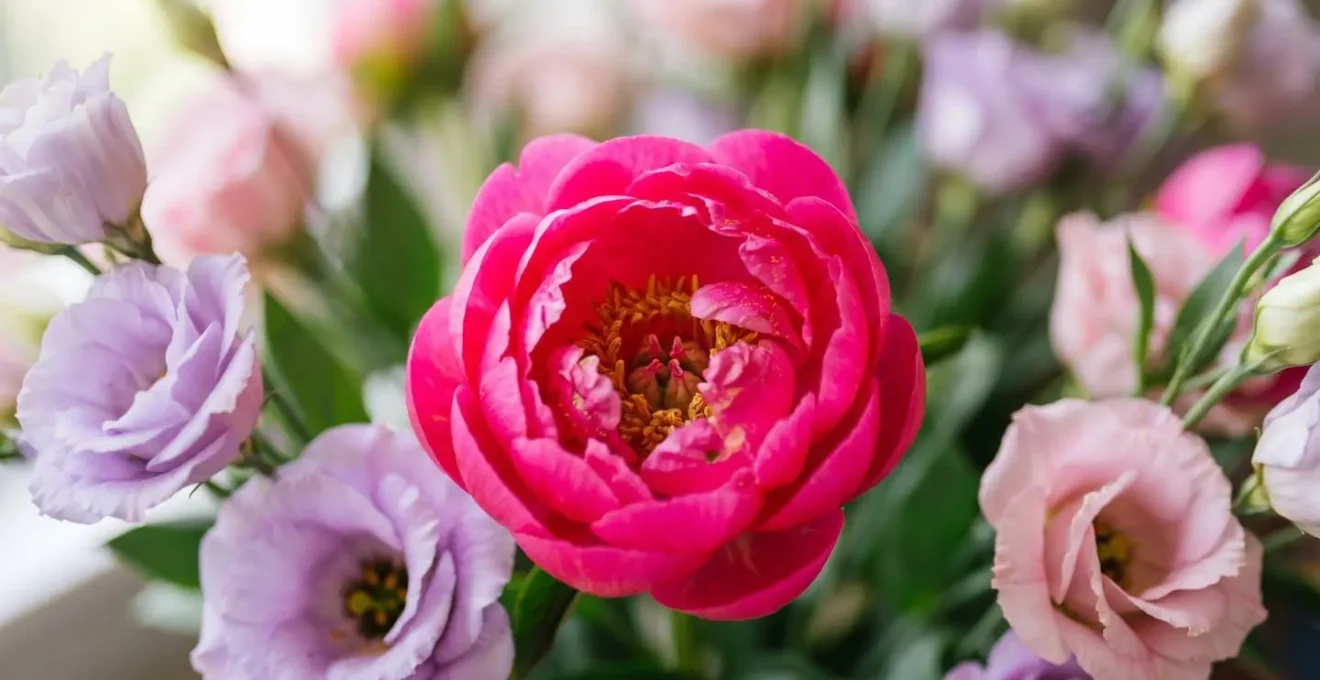
As this image demonstrates, the eye is immediately drawn to the sharply focused, high-saturation flower at the core. The surrounding low-saturation pastels recede gracefully into the background, creating a soft halo effect that supports the focal point. This isn’t about avoiding vibrant colors; it’s about deploying them with surgical precision. To create a harmonious palette, you must either commit to a consistent level of saturation (all pastels or all jewel tones) or use the contrast in saturation to consciously direct the visual flow of your arrangement.
The Bridge Color: How to Connect Clashing Hues with a Transitional Tone?
When working with a bold palette, such as a fiery combination of magenta and tangerine, the instinct is often to reach for white or cream flowers to “break up” the intensity. While this can work, it’s a missed opportunity. Professionals use a more sophisticated technique: the bridge color. A bridge color, or transitional tone, is a complex hue that contains undertones of the two colors it is meant to connect. Instead of a simple neutral, think of a dusty mauve, a warm champagne, a silvery greige, or a blush-toned beige. These colors act as seamless connectors, creating a graceful transition rather than an abrupt separation.
The art of selecting a bridge color lies in a deep understanding of undertones. For instance, to connect a warm palette, foliage with yellow-green tones like Alchemilla Mollis is far more effective than a cool, blue-toned Eucalyptus. The floral market now offers incredible options specifically for this purpose. Varieties like ‘Quicksand’ roses (a perfect greige-blush), ‘Cafe au Lait’ dahlias (champagne-blush), or ‘Koko Loko’ roses (a complex dusty mauve that shifts to lavender) are coveted by designers for their ability to link difficult colors. An even more advanced technique is to use a “bicolor bridge”—a single flower, like certain varieties of tulips or cosmos, that naturally contains both clashing hues in its petals.
To be effective, the bridge color shouldn’t dominate. It should be used as a minority element, typically making up 15-20% of the arrangement’s volume. Its role is to weave through the dominant hues, softening their edges and creating a cohesive, painterly effect. This thoughtful use of transitional tones is what separates a merely colorful arrangement from a truly masterful one.
Daylight vs Candlelight: How Venue Lighting Changes Your Color Palette?
A floral palette that looks stunning in your sun-drenched studio can fall completely flat or turn muddy in the warm, low light of an evening event venue. This is because light is the final, and perhaps most critical, ingredient in color theory. The color of the light source dramatically alters how we perceive the color of the flowers. This concept, known as color performance, is something every event florist must master. A flower’s color is not a static property; it is a direct result of the spectrum of light reflecting off its petals and into our eyes.
Different light sources have different “color temperatures,” measured in Kelvin (K). Natural daylight (around 5500K) provides the most balanced, true-to-life rendering of colors. However, warm tungsten bulbs or candlelight (around 2700K) are rich in yellow and red light. Under this warm glow, pure whites will appear creamy, yellows will become intensely golden, and reds and oranges will pop with incredible richness. Conversely, deep blues and purples, which lack warm tones to reflect, can absorb this light and appear dull, black, or “bruised.” Cool, bright LED lights (5000K+) can have the opposite effect, making warm colors appear muted and sometimes making whites look harsh.
Interestingly, the industry standard for measuring a light’s color accuracy, the Color Rendering Index (CRI), doesn’t always tell the whole story. As confirmed by research from NIST color perception studies, a lighting source with 95 CRI can sometimes appear harsh, while a lower 70 CRI source might be more flattering. This highlights the importance of testing your palette in lighting conditions that mimic the final venue.
| Color Family | Warm Tungsten/Candlelight (2700K) | Bright LED (5000K+) | Natural Daylight (5500K) |
|---|---|---|---|
| Deep Blues & Purples | Turn nearly black, lose vibrancy | Appear cool and true | Vibrant, accurate hue |
| Pure Whites | Appear warm cream/ivory | Can blow out/appear harsh | Crisp, clean white |
| Vibrant Pinks | Hold color well, appear warmer | Hold color well, slightly cooler | Most accurate representation |
| Reds & Oranges | Intensify, appear richer | May appear slightly muted | Balanced, true tone |
| Yellows | Glow warmly, appear golden | Appear cooler, lemon-toned | Bright, cheerful yellow |
| Greens (Foliage) | Appear olive/bronze-toned | Appear vibrant, sometimes harsh | Natural, balanced green |
Yellow and Joy: Does Color Really Influence Guest Mood at Events?
Beyond pure aesthetics, the colors you choose for an event’s floral design play a subconscious role in shaping the mood of guests. This is the heart of emotional journey design: using color to evoke specific feelings, from excitement and joy to tranquility and romance. While color psychology can be subjective, certain patterns are well-documented. Warm colors like yellow, orange, and pink are generally perceived as uplifting, energetic, and happy. Cool colors like blue, green, and purple tend to evoke feelings of calm, serenity, and sophistication.
The question for a designer is how robust these emotional effects are. Can a single color choice truly influence a room full of people? Scientific research suggests it can, and that some colors have a more resilient psychological impact than others. This is a powerful tool for event florists who are tasked with creating a specific atmosphere. For a celebratory wedding reception, a palette rich in warm tones can actively contribute to a joyful and energetic mood. For a serene memorial service or a formal corporate dinner, a cool-toned palette can foster an atmosphere of calm and focus.
Case Study: The Resilient Uplifting Effect of Orange Flowers
A therapeutic landscape research study explored the emotional impact of different flower color combinations. It found that arrangements with orange flowers consistently provided a strong uplifting and cheerful emotion in participants. Remarkably, this positive feeling was maintained even when up to 50% of the orange flowers were replaced by the complementary cool color, blue. In stark contrast, the relaxing effect of a 100% blue arrangement was completely lost when just 25% of the flowers were replaced with orange ones. This demonstrates that warm, uplifting colors have a more dominant and resilient psychological impact than cool, relaxing colors, giving designers a clear strategy for ensuring a joyful atmosphere.
This insight is invaluable. If your goal is to create an uplifting mood, incorporating a strong warm color like orange gives you a powerful and durable tool that can withstand the addition of other colors without losing its core emotional impact.
Bridge Colors: Which Flowers Connect Pink to Orange Seamlessly?
The transition from a cool pink to a warm orange is a classic floral design challenge. It’s the territory of sunrise and sunset palettes, but if handled incorrectly, it can look striped and disjointed. The secret to a seamless transition is to think like a painter and create a gradient. This involves carefully selecting flower varieties that represent each micro-step between the two anchor colors. It’s not about placing pink next to orange; it’s about finding the peachy-pinks, corals, and warm apricots that bridge the gap.
As the experts at Sami Sacha Flowers note, this methodical approach is a surefire way to create a beautiful effect. This philosophy of gradual progression is key to making complex palettes feel natural and harmonious, guiding the eye gently from one hue to the next.
Choosing one color and arranging flowers in clusters, gradually taking it from lightest to darkest, will always have an aesthetically pleasing effect.
– Sami Sacha Flowers, 5 Color Palette Tricks to Elevate Your Floral Design
Building a successful gradient palette requires a “shopping list” mentality, where you identify specific varieties to fill each role in the color story. You need a true pink, a true orange, and at least two or three transitional flowers to connect them. The arrangement of these flowers in clusters or blocks, rather than an even mix, further enhances the gradient effect.
Action Plan: Your Gradient Shopping List for a Pink-to-Orange Palette
- Start Position (True Pink): Secure your coolest anchor point. Source flowers like the ‘Sarah Bernhardt’ Peony or other soft, true pink varieties for a pure expression of the color.
- First Transition (Peachy-Pink): Introduce the first hint of warmth. Look for ‘Juliet’ Garden Roses or similar peachy-pink blooms that begin to lean towards orange.
- Bridge Position (Coral): Find the perfect midpoint. Use ‘Coral Charm’ Peonies or vibrant coral-toned ranunculus, which sit squarely on the spectrum between pink and orange.
- Second Transition (Warm Apricot): Continue the warming trend. Incorporate varieties like warm apricot-toned lisianthus or the versatile ‘Quicksand’ rose to move closer to your final hue.
- Final Position (True Orange): Complete the gradient with a pure, warm anchor. Select ‘Tango’ Tulips, vivid orange ranunculus, or saturated orange dahlias to provide a strong, warm finish.
Four Color Harmony: How to Balance a Complex Tetradic Palette?
A tetradic palette, which uses four colors arranged in two complementary pairs on the color wheel, is one of the most complex and potentially rewarding harmonies. It offers a rich, vibrant, and multifaceted look, but it is also the most likely to descend into chaos if not handled with strict control. The primary challenge is that with four distinct hues competing for attention, the arrangement can easily look like a random assortment of flowers with no clear visual direction.
The solution lies in two key principles: establishing a clear color dominance and practicing spatial grouping. You cannot treat all four colors equally. One must be the clear star of the show. The 60-30-10-10 rule is the framework for achieving this. One color should dominate, making up 60% of the visual mass. A secondary color provides support at 30%, and the final two colors act as small, jewel-like accents at 10% each. Equally important is ensuring a distinct hierarchy of value; a palette with one light, one dark, and two mid-tone colors is far more balanced than four colors of the same value, which would blend into visual ‘mud’.
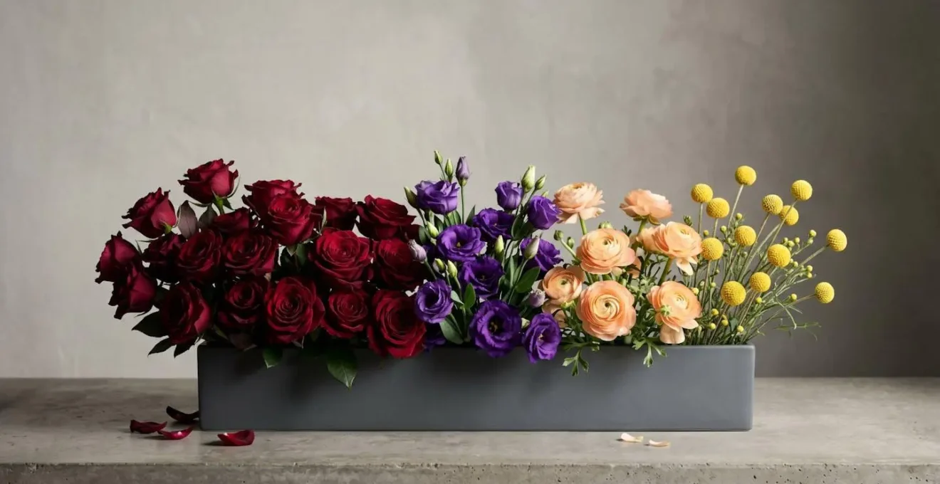
The second principle, spatial grouping or color blocking, is critical for clarity. As seen in the image above, instead of mixing the four colors evenly throughout the arrangement, you create distinct ‘moments’ or zones for each color. This allows the eye to appreciate each part of the complex harmony individually before taking in the whole. One section might be a lush block of deep burgundy, which transitions into a cluster of violet, then a pop of peach, and finally an accent of soft yellow. This technique gives the palette structure and prevents the colors from becoming visually noisy.
Key Takeaways
- True color mastery is not about the color wheel (hue), but about controlling saturation (intensity) and value (lightness).
- Use high-saturation colors deliberately as focal points to create ‘visual weight’ and guide the eye.
- Connect clashing colors with sophisticated ‘bridge tones’ (like champagne or dusty mauve) instead of just white.
- Always test your color palette under the event’s specific lighting, as warm or cool light dramatically alters color performance.
Chromatic Theory: The Final Step to Professional Mastery
Embracing the full scope of chromatic theory is the final step in your journey from enthusiast to professional designer. It’s about recognizing that color is a dynamic, living element within your work. As the educators at Team Flower emphasize, it’s a skill that can be learned and mastered.
Color is one of the most important aspects of floral design, and you can totally learn how to use it like a pro.
– Team Flower Education, Diving into the Flower Color Wheel
This mastery involves internalizing the concepts we’ve discussed: using saturation and value to create hierarchy and depth, employing bridge tones for seamless transitions, and accounting for the color performance under specific lighting. But the ultimate level of expertise comes from considering the fourth dimension of color: time. Flowers are not static objects; they evolve. A tulip may open and become more vibrant over several hours, while a rose might shift its hue as it ages throughout an event.
Case Study: Time as the Fourth Dimension of Color
An expert event florist doesn’t just design for the moment of creation; they design for the entire duration of the event. As highlighted by industry analysis in Florists’ Review, flower color is not a constant. Some tulip varieties intensify in color as they open, while certain roses may fade or shift under heat. This requires planning for how the palette will evolve over a 4-8 hour event. Top-tier florists conduct ‘aging tests,’ observing how their chosen flowers perform over time in expected venue conditions. They then adjust their initial palette to account for these predictable shifts, ensuring the arrangement looks as beautiful at the end of the night as it did at the beginning.
This forward-thinking approach is the pinnacle of floral color theory. It’s the synthesis of art and science—understanding the technical properties of color, light, and biology, and using them to create a dynamic and intentional experience that unfolds beautifully over time.
By moving beyond the basic color wheel and embracing these advanced variables, you can begin to create vibrant, complex, and emotionally resonant floral palettes with confidence and intention. Start today by analyzing your flower inventory not just by hue, but by saturation and value, and you will unlock a new level of artistry in your work.