The key to selling bold color is shifting from vendor to consultant; it’s not about persuasion, but education on the principles of color architecture and branding.
- Success with bold palettes relies on mastering technical aspects like lighting (uplighting), foliage contrast, and photographic limitations (red channel clipping).
- Use established design rules like the 60-30-10 principle and “bridge colors” to create structured, high-fashion looks that feel intentional, not chaotic.
Recommendation: Frame the color conversation around the couple’s unique ‘brand story,’ using color to express their energy and confidence, turning a subjective choice into a powerful narrative tool.
The endless scroll of blush, sage, and ivory can leave any creative florist feeling uninspired. You see the potential for vibrant, unforgettable wedding designs, yet your clients, tethered to pastel Pinterest boards, hesitate. The common advice—show more mood boards, suggest small “pops” of color—often falls flat because it fails to address the bride’s core fear: the fear of getting it wrong. They worry a bold choice will look tacky, dated, or overwhelming, and defaulting to the safety of neutrals seems like the only prudent option.
This is the moment to evolve your role. The challenge isn’t just about incorporating a splash of magenta; it’s about mastering the language of color to become a trusted advisor. It involves understanding the technical nuances of how a deep red behaves on a digital sensor, the transformative power of dark foliage to create depth, and how uplighting can completely alter a palette’s mood after sunset. It’s about shifting the conversation from personal taste to professional strategy.
But if the true secret wasn’t about persuading them to love color, but rather educating them on how color creates an unforgettable brand experience? This guide is built for the forward-thinking florist who is ready to move beyond fulfilling orders and start directing visual narratives. We will deconstruct the principles that make bold palettes work, equipping you with the technical knowledge, psychological insights, and strategic frameworks to lead your clients from color-hesitant to color-confident.
By mastering the concepts in this guide, you will be able to articulate not just what colors to use, but precisely why they work together to tell a compelling story. Let’s explore the architecture of a bold and beautiful wedding palette.
Summary: A Florist’s Strategic Handbook for Bold Color Design
- Pink and Red: How to Make a Clashing Combo Look High Fashion?
- Dark Foliage: Why Copper Beech Makes Jewel Tones Pop?
- Digital Sensors: Why Reds Blow Out in Photos and How to Fix It?
- Uplighting: How Colored Lights Affect Your Floral Colors at Night?
- Energy and Confidence: What Does a Bright Palette Say About a Brand?
- Pink and Red: How to Make a Clashing Combo Look High Fashion?
- Color Emotion: Which Palette Triggers Trust in Corporate Design?
- chromatic theory
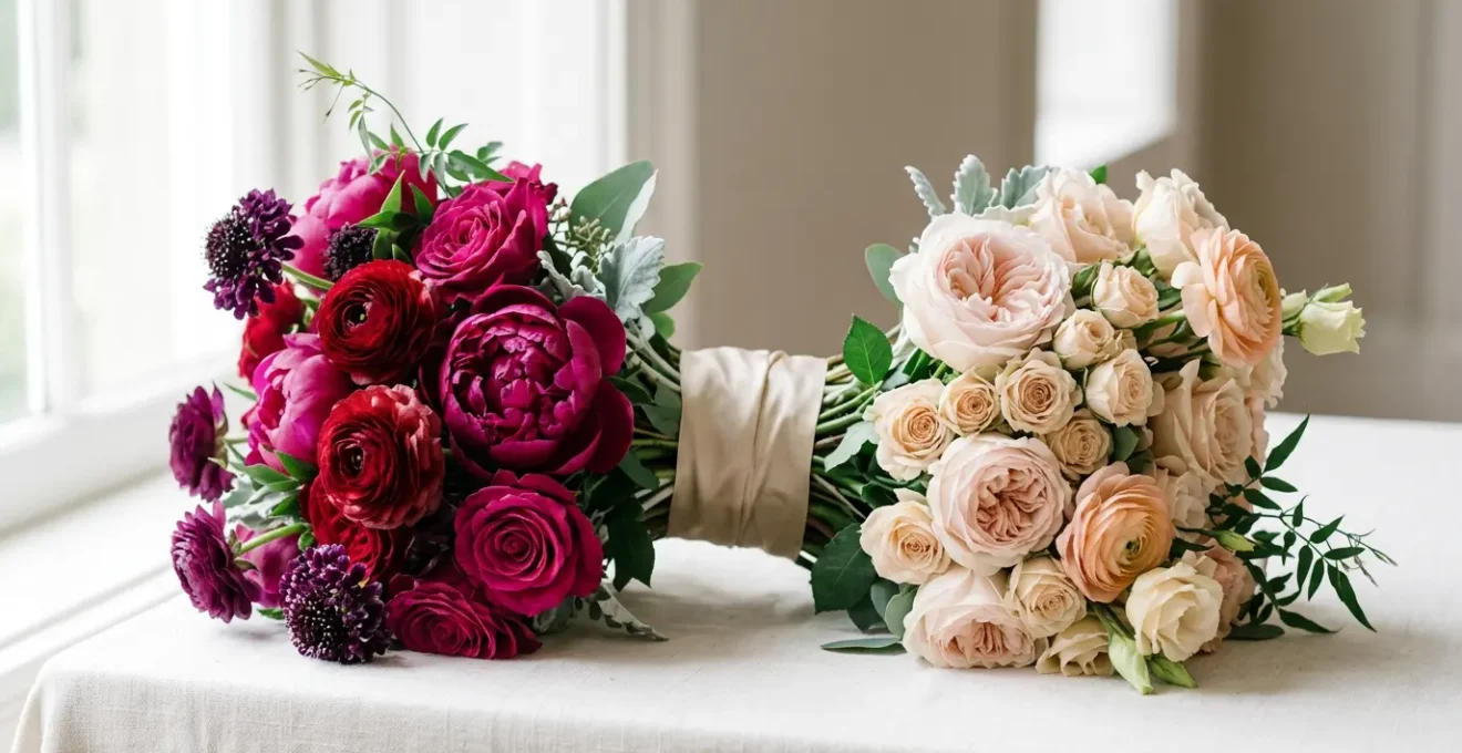
Pink and Red: How to Make a Clashing Combo Look High Fashion?
The combination of pink and red is a classic test of a designer’s confidence. To a hesitant client, it can sound like a Valentine’s Day cliché or a jarring clash. However, to a trend forecaster, it’s a hallmark of high-fashion and editorial design. The secret to elevating this pairing lies in moving away from simple color-blocking and embracing a more sophisticated concept: Palette Architecture. It’s not about forcing two colors together; it’s about building a structure around them to create harmony.
The most effective technique is the use of a “bridge” color. This is a neutral or metallic shade that links the two dominant hues, giving the eye a place to rest and making the combination feel intentional. A champagne gold, a deep charcoal, or a creamy ivory can act as this crucial mediator. Furthermore, the interplay of texture and sheen is vital. Combining matte textures, like velvet ribbons, with glossy elements, such as lacquered vases, adds a layer of depth that prevents the colors from feeling flat. It creates a tactile experience that reads as luxurious and complex.
Finally, a clear hierarchy is essential. Instead of an equal 50/50 split, which can feel competitive, applying the 80/20 rule establishes a clear narrative. One color becomes the dominant force, setting the overall mood, while the other serves as a powerful, deliberate accent. This structured approach transforms a potentially clashing combo into a dynamic, confident, and undeniably chic statement.
Dark Foliage: Why Copper Beech Makes Jewel Tones Pop?
To make bold jewel tones truly sing, a designer’s best tool is often not another flower, but the strategic use of dark foliage. Varieties like Copper Beech, with its deep wine-red leaves, serve a purpose that goes far beyond simple filler. They introduce the principle of light-absorbing depth. Unlike bright green leaves that reflect light, dark foliage absorbs it, creating areas of deep shadow and negative space. This effect carves out the visual field, forcing the eye to focus on the luminous jewel-toned blooms, making them appear more vibrant and saturated in contrast.
The deep, rich tones of Copper Beech or Ninebark provide a velvety, theatrical backdrop. This isn’t just an aesthetic choice; it’s a lesson in color theory. The dark, desaturated background pushes the brighter, saturated colors forward, a technique used by painters for centuries to create drama and focus. Think of it as creating an internal frame within the arrangement itself, guiding the viewer’s gaze exactly where you want it to go.
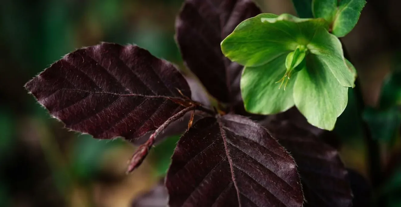
Beyond the artistic benefits, there is a compelling financial argument to be made. As a strategic budget allocation shows, dramatic, space-filling dark foliage allows a designer to use fewer expensive jewel-toned blooms while achieving a greater overall visual impact. This presents a powerful value proposition for the client: a richer, more impactful look that is also cost-effective. It’s a choice that is both artistically sound and financially savvy.
Digital Sensors: Why Reds Blow Out in Photos and How to Fix It?
One of the most critical conversations a florist can have regarding bold palettes has nothing to do with flowers and everything to do with technology. The concept of Chromatic Integrity—ensuring colors remain true and detailed from the event to the final photos—is paramount. True reds are notoriously difficult for digital cameras to capture accurately. The red color channel on a digital sensor is more sensitive than the green and blue channels, causing it to become oversaturated or “clipped” easily, losing all texture and detail in a flat, glowing mass.
As a technical expert explains, this is a hard limit of the technology. In his guide on channel clipping, photographer Bob Atkins notes:
The red channel is clipped at a value of 255. Once this has happened, even if exposure is increased, the channel value doesn’t change, it cannot be higher than 255.
– Bob Atkins, Photography Technical Guide – Channel Clipping
This is not something a photographer can easily “fix in post.” Once that detail is gone, it’s gone forever. As a florist, your role is to be a proactive collaborator. You can guide clients toward specific varietals of red flowers (like a deep wine ‘Black Baccara’ rose versus a bright fire-engine ‘Freedom’ rose) that have more tonal variation and are less prone to blowing out. Most importantly, you must facilitate a pre-event “color meeting” between yourself, the couple, and the photographer. This is the forum to discuss the palette, the lighting plan, and the desired photo mood, ensuring the photographer is prepared to handle the vibrant colors and prevent channel clipping from ruining the integrity of your design in the final wedding album.
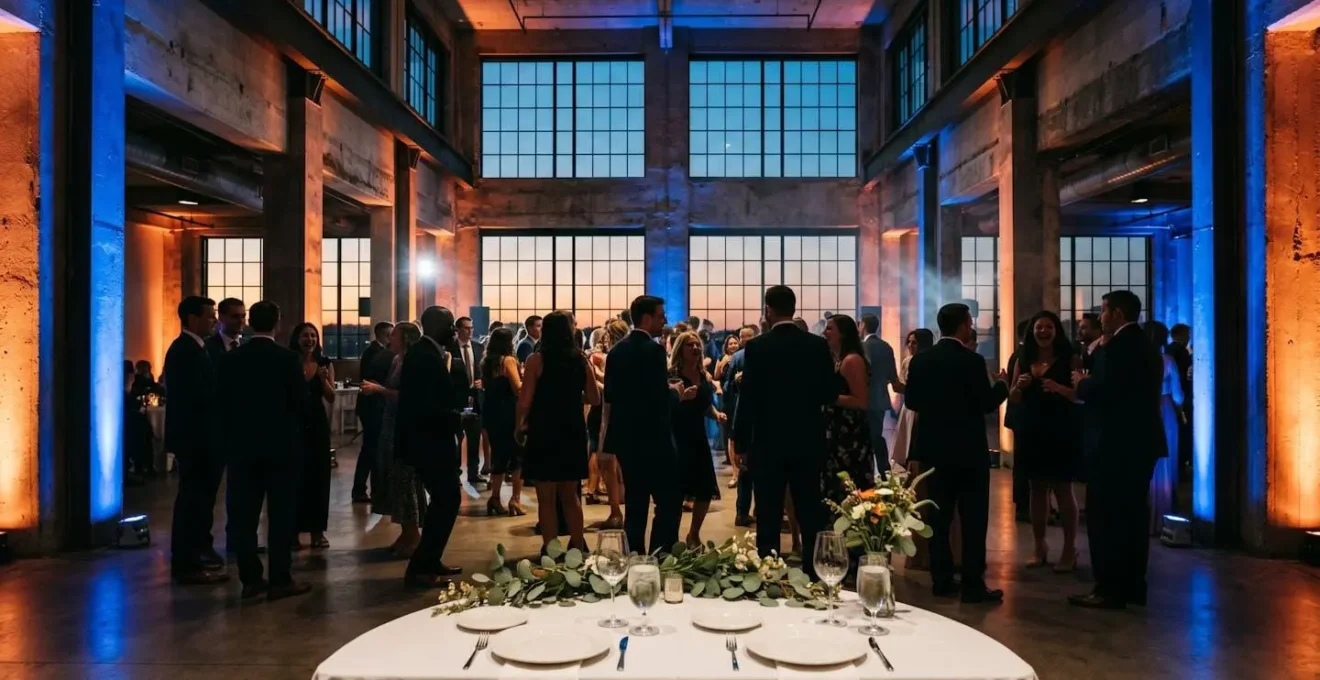
Uplighting: How Colored Lights Affect Your Floral Colors at Night?
The Chromatic Integrity of your floral design doesn’t end when the sun goes down. A reception space bathed in colored uplighting can completely transform—or tragically sabotage—your carefully curated palette. A bride who loves her blush and ivory bouquet might be horrified to see it turn a sickly yellow under green lighting or an alien-like blue. This is a critical educational touchpoint for any client considering a bold color scheme.
Understanding the basic science of additive and subtractive color is key. Amber uplighting, for example, is a safe and popular choice because it adds warmth, turning pinks into rich coral and oranges into deep gold. Blue light, however, is subtractive. It will absorb the red tones in your flowers, turning a vibrant red arrangement into a mysterious magenta or even a muddy purple. The most important rule to communicate is to almost never use green uplighting on florals, as it can make beautiful arrangements look dull and lifeless. As industry professionals consistently note, uplighting is a cost-effective way to transform a venue, but it requires planning.
Presenting this information in a clear, structured way demystifies the process for the client. A simple guide can turn a potentially complex problem into a collaborative design decision, reinforcing your role as an expert who considers every variable.
| Uplighting Color | Effect on Floral Colors | Best Use Case | Mood Created |
|---|---|---|---|
| Amber Light | Pink flowers → warm coral glow; marigold orange → rich warm gold | Dinner service, romantic ambiance | Warm, intimate, candlelit feel |
| Blue Light | Red flowers → mysterious magenta/purple; white flowers → cool silver-blue | Cocktail hour, modern aesthetic | Cool, dramatic, sophisticated |
| Green Light | Yellow flowers → sickly appearance (AVOID); green foliage → enhanced vibrancy | Accent on greenery only, not florals | Natural, organic (when used correctly) |
| Purple/Lavender | White flowers → soft lavender glow; pink flowers → deeper magenta | Open dancing, energetic atmosphere | Luxurious, regal, celebratory |
| Warm White/Champagne | Preserves natural floral colors; enhances warm tones subtly | Ceremony, classic venues | Timeless, elegant, safe |
Energy and Confidence: What Does a Bright Palette Say About a Brand?
Beyond the technicalities of color theory, the most compelling argument for a bold palette is what it communicates. A wedding is, in essence, the first major “brand launch” for a couple. The colors they choose are a form of non-verbal communication, setting the tone for the entire event and telling guests what to expect. While a pastel palette whispers of romance and tradition, a bold palette shouts with energy, confidence, and personality. It signals a couple that is unafraid to be themselves and is focused on creating a memorable, high-energy experience.
This isn’t just a feeling; it’s rooted in consumer psychology. A study on color psychology in design reveals that for many people, color is a primary driver of choice. While the study is about products, the principle applies: people “buy into” the feeling a color evokes. In fact, research demonstrates that for up to 84% of consumers, color was the primary influence when making a purchase. Choosing a color palette is the first major decision guests will experience, often through the save-the-date, and it frames their entire perception of the event to come.
Embracing a bold palette is a declaration of modernity and self-assurance. As wedding photographer Ashley Brownie observes, this is not a rejection of the past but a reinterpretation of it.
Couples embracing bold wedding color palettes aren’t rejecting tradition; they’re modernizing it. Color sets the tone for the entire day.
– Ashley Brownie, Beyond White and Pastels
By framing the discussion around their personal Brand Narrative, you help the couple see color not as a risky decorative choice, but as the most powerful tool they have to express who they are and the joyful celebration they want to create.
Pink and Red: How to Make a Clashing Combo Look High Fashion?
The theoretical principles of making “clashing” colors work—using bridge colors and textural interplay—become much more tangible when seen in a real-world application. The core lesson is that the success of a bold palette often depends on the environment that surrounds it. The venue’s existing materials, lighting, and architecture are not a limitation but a key part of the Palette Architecture. They can serve as the “bridge” that grounds the entire design.
This principle is a powerful tool for convincing a client. Instead of presenting a color palette in a vacuum, you can show them how it will interact with their chosen space. By anchoring daring color choices to neutral, natural elements already present in the venue, you make the entire concept feel more integrated and less intimidating. The bold colors don’t feel like an imposition; they feel like an intentional enhancement of the space.
Case Study: The Anchored and Edgy Palette
The principle of using an environmental ‘bridge’ was perfectly demonstrated at a Texas Hill Country wedding. The couple opted for a daring combination of chartreuse and marigold accents. In a sterile white ballroom, this might have felt overwhelming. However, set against the venue’s rustic wood beams and natural stone architecture, the result was both natural and edgy. The bold color combination worked because it was anchored by the venue’s strong, neutral textures. This case illustrates how architectural elements can serve as the foundational ‘bridge’ between daring color choices, proving the ‘clashing’ combo rules apply far beyond just pink and red.
This approach allows you to reframe the conversation. You’re not just asking a client to trust a color swatch; you’re showing them a holistic vision. When they can see how the vibrant marigold will pop against the warm wood or how the chartreuse will energize the cool stone, the fear of a “clash” dissipates, replaced by excitement for a cohesive, high-impact design.
Color Emotion: Which Palette Triggers Trust in Corporate Design?
The leap from a “safe” pastel to a bold, vibrant palette is an emotional one for a client. Your role as a consultant is to build a bridge of trust to help them cross it. Interestingly, the psychological principles that guide a bride’s color decision are the same ones used by major corporations to build brand loyalty. After all, research has shown that color can increase brand recognition by up to 80%, a testament to its power in building connection and identity. We can borrow these trust-building strategies for our clients.
Instead of a drastic, all-or-nothing switch, you can use a phased approach that makes the client feel heard and secure. This is the “Trust Triangle” in action: a method that honors their initial vision while gently expanding it. It begins with their “safe” color as a foundation, introduces a single complementary bold shade as a “friend,” and then uses visualization tools to show them the complete, harmonious picture. This isn’t a sales tactic; it’s a collaborative design process that builds confidence at every step.
The goal is to create a palette that feels like an exciting discovery, not a risky compromise. By validating their initial preference for a pastel but showing them how a bold counterpart can create memorable impact, you empower them to make a confident choice. It’s a structured journey from uncertainty to excitement.
Your Action Plan: Auditing the Couple’s Color Identity
- Points of Contact: List all the channels where the color story will be told, from invitations and websites to florals, attire, and reception lighting.
- Collect: Inventory all existing aesthetic elements, including the venue’s inherent colors, the client’s Pinterest board, and their favorite non-wedding design styles.
- Coherence: Compare these elements against the couple’s stated values and desired wedding vibe (e.g., “fun and energetic,” “romantic and moody”). Do the visual cues match the descriptive words?
- Memorability & Emotion: Objectively evaluate the proposed palette. Is it unique and memorable, or does it blend in? What specific emotion does this color combination evoke?
- Plan for Integration: Develop a prioritized plan to introduce or substitute colors to fill any gaps, focusing first on high-impact elements like the bridal bouquet or entryway installation.
Key Takeaways
- Shift your role from a flower vendor to a brand consultant who uses color to tell a couple’s unique story.
- Master the technical side of color—lighting, photography, and foliage contrast—to guarantee the ‘Chromatic Integrity’ of your designs from day to night.
- Use structured design principles like the 60-30-10 rule and ‘bridge’ colors to make bold choices feel intentional, balanced, and high-fashion.
chromatic theory
At the heart of every well-designed, professional-looking color palette—bold or otherwise—is a simple, powerful secret: chromatic theory applied through a clear hierarchical structure. For clients afraid of color looking “messy” or “too much,” introducing a foundational rule like the 60-30-10 principle is the ultimate confidence-builder. It transforms the subjective art of color selection into a balanced, almost mathematical formula. This rule provides the blueprint for a sophisticated and cohesive design.
The application is straightforward and logical:
- 60% Primary/Neutral Color: This is the canvas. It dominates the largest surfaces like linens, venue walls, and major furniture. It anchors the design and provides visual stability.
- 30% Secondary Bold Color: This is the main personality of the palette. It’s used on medium-impact items like bridesmaid dresses, major floral installations, or accent walls highlighted with uplighting.
- 10% Accent Bold Color/Metallic: This is the final sparkle. It appears in the small details that delight guests—napkins, menu cards, a single surprise flower in a bouquet, or metallic cutlery.
By presenting this framework, you’re not just showing colors; you’re explaining a professional system for visual balance. It prevents any single color from overwhelming the senses while ensuring the bold hues have a significant impact. This structured approach is the antidote to the fear of chaos, proving that a bold palette can be both exciting and impeccably controlled. This trend is gaining momentum, as wedding industry experts observe that couples are increasingly desiring bold color, often by mixing one or two strong hues into an otherwise muted palette for eye-catching contrast.
By moving beyond simple color matching and embracing your role as a strategic color consultant, you can guide any client toward a palette that is not only beautiful but also a confident and authentic reflection of their story. The next step is to start integrating these principles into your client conversations, beginning with the 60-30-10 rule as a simple, powerful starting point.